study app
due to the covid-19 pandemic, schooling through digital apps became a necessary reality. unfortunately, study apps in india focused heavily on ideas like ‘scoreboards’1 and ‘study-streaks’2, manipulating parentsʼ fears and prioritising sales over a child’s long-term growth.
so, i joined a team that was trying to do better: by imagining a digital companion which promoted good study-habits (regular and independent study) over ‘content consumption’. i worked with the company’s head of design, building experience prototypes for key features in it.
over time: we crafted a conversational interface (without voice or chat) ; designed reports that eschew charts, graphs or comparisons1 ; invented a highlight/select tool ; and helped encode the design-team’s principles (for a better study app) into the product.
products as screens conversations
study apps are not an end in themselves : they are merely one part of a continuous conversation3 between parents and children4. this is why we imagined the product to be a conversational space for three people: the student, the parents, and the study-coach, tara (who personified the app).
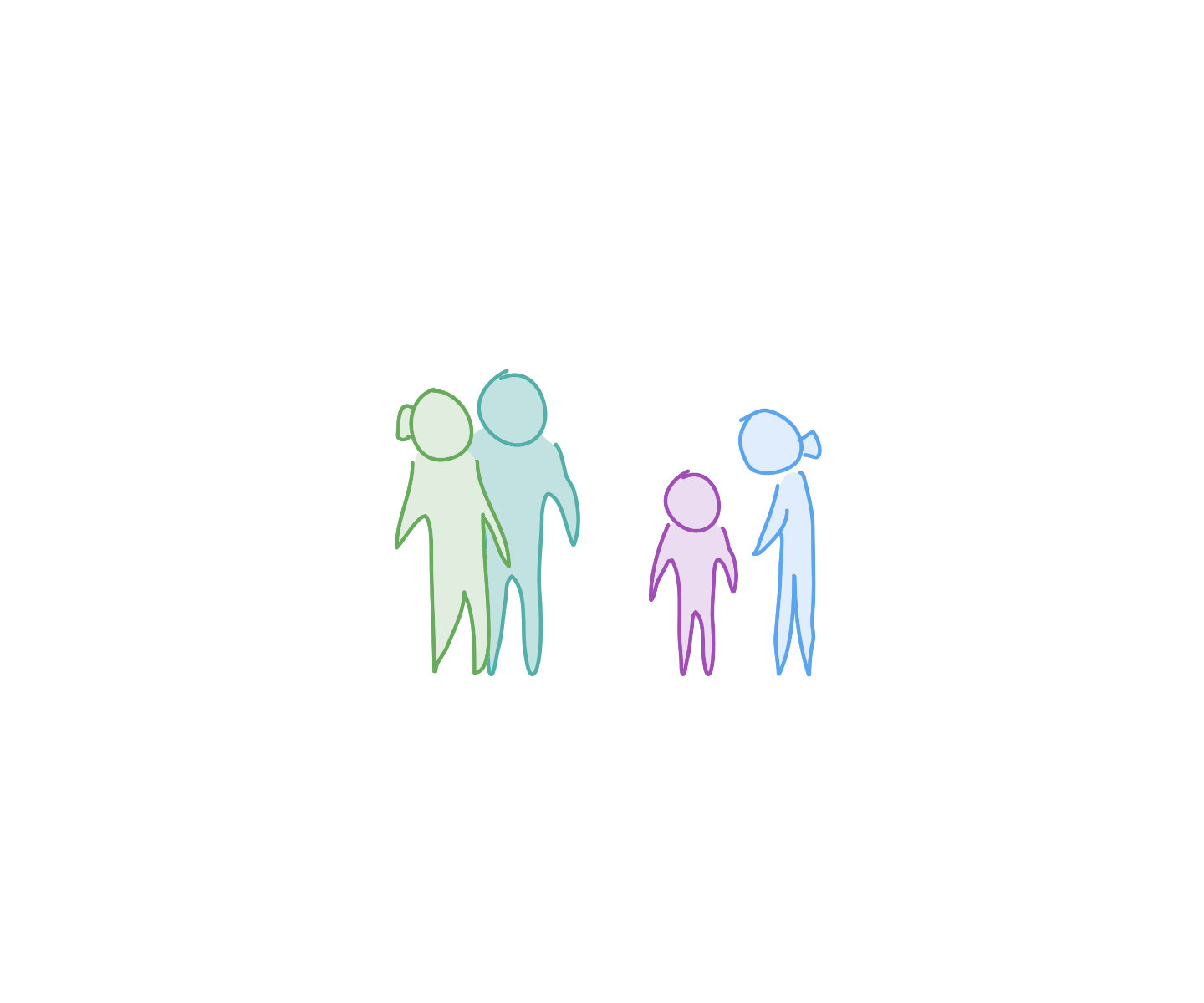
by sketching conversations between these people, we built experience flows of how they’d feel at various points in the year (eg. before a test, at the start of a subscription, at the end of a week, etc).
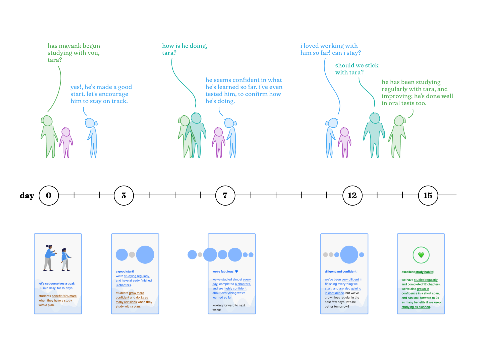
this conversational approach also established a personality and tone for the product, and helped us think more holistically about how the app behaves (instead of just how it looks).
—
research, data, design
we validated our ideas continuously: interviewed parents and students, listened to sales-and-support staff, and analysed quantitative data. we used spreadsheets when working with small datasets : when studying the entire dataset, we wrote sql queries instead.
we combined intuition, research, data-analysis and prototypes to good effect; and could move independently from idea to analysis to prototype to validation.
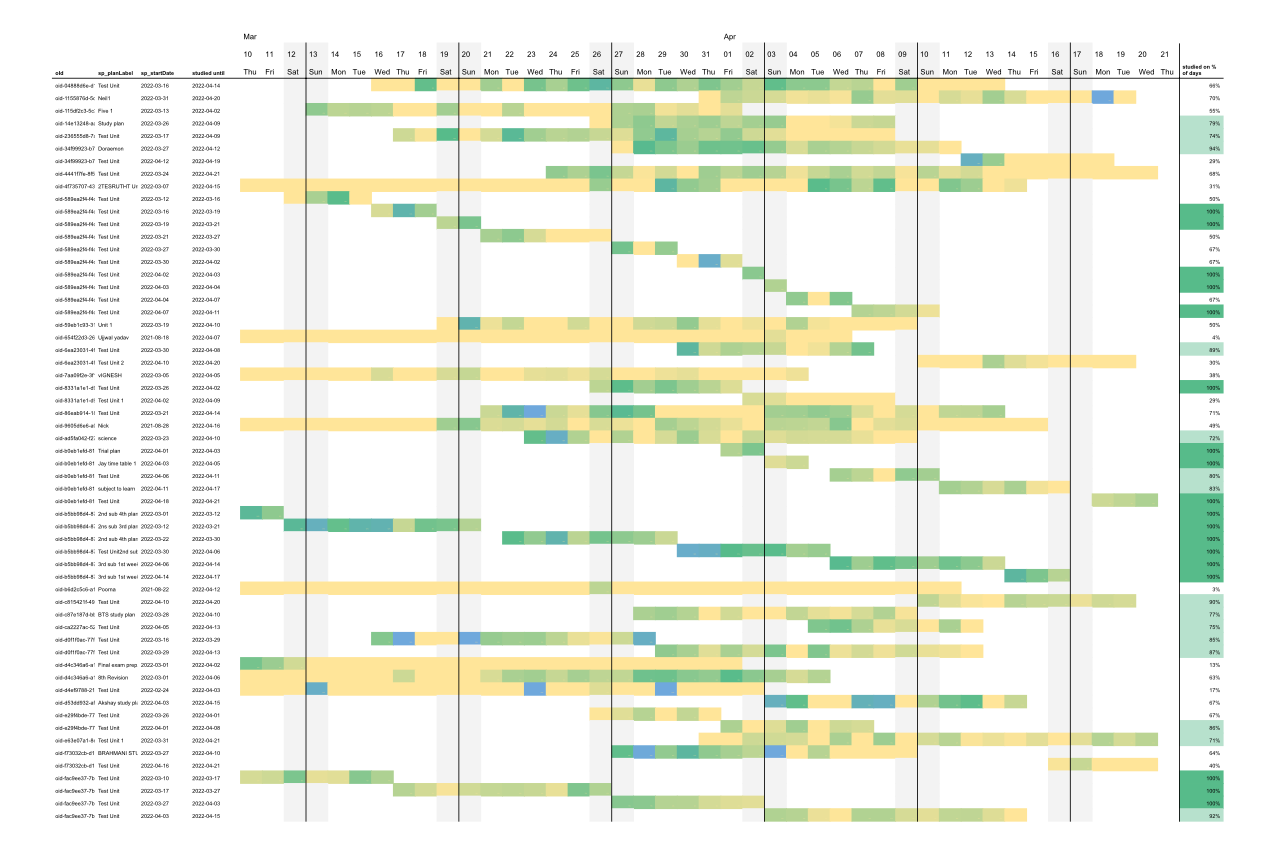
i used this chart to explain how even “highly active” students didn't study every day (key: studied or didn't), and that study-apps shouldn't penalise students for missed study-days. we then re-defined what terms like ‘regular study’ and ‘diligent student’ objectively mean ; eventually, we encoded our understanding into feature-briefs, messaging, and prototypes.
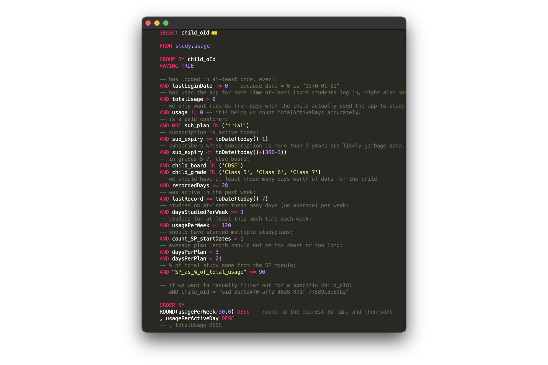
i wrote this query to help us find different kinds (‘cohorts’) of students. we could then study their behaviour, test hypotheses, or even reach out to them for specific feedback. we discovered trends in planning behaviour and study frequency, and brought those insights into feature-designs.
we also supported the company’s data-science efforts by writing hypotheses and, then, specifying what kinds of data we’d require to validate those hypotheses. (this is one example.)
—
design documentation and versioning
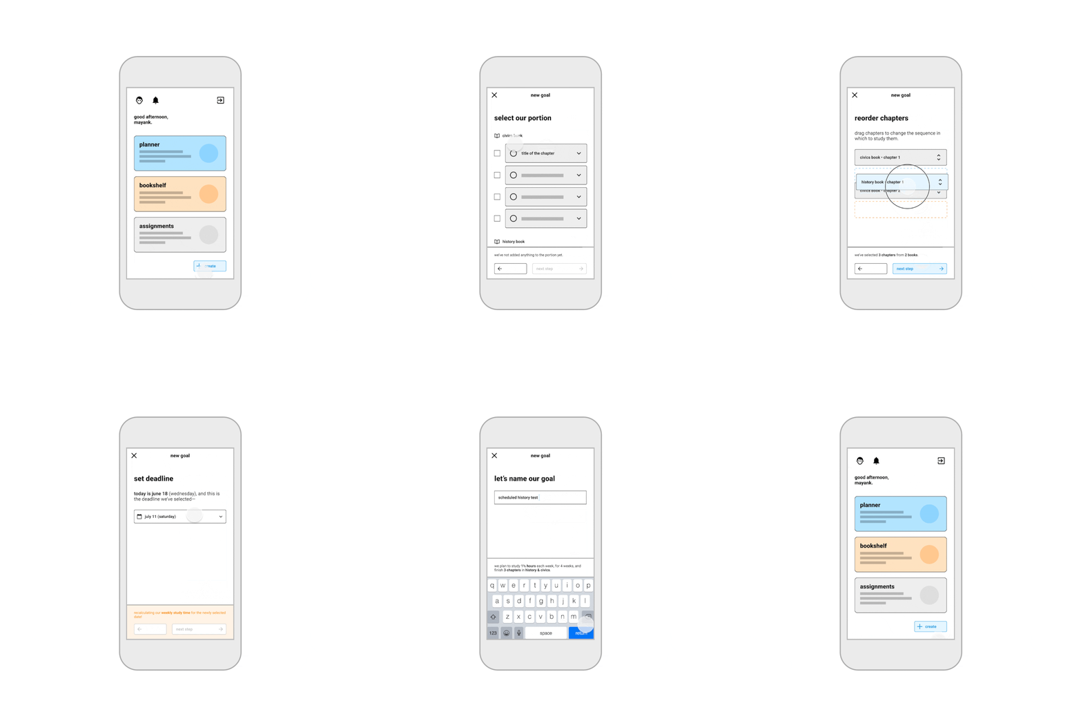
we drew wireframes to describe how product-features appear, and built interactive flows to explain how those features behave. notes and revisions were thoroughly documented to make it easier to communicate (or delegate) work to designers and engineers.
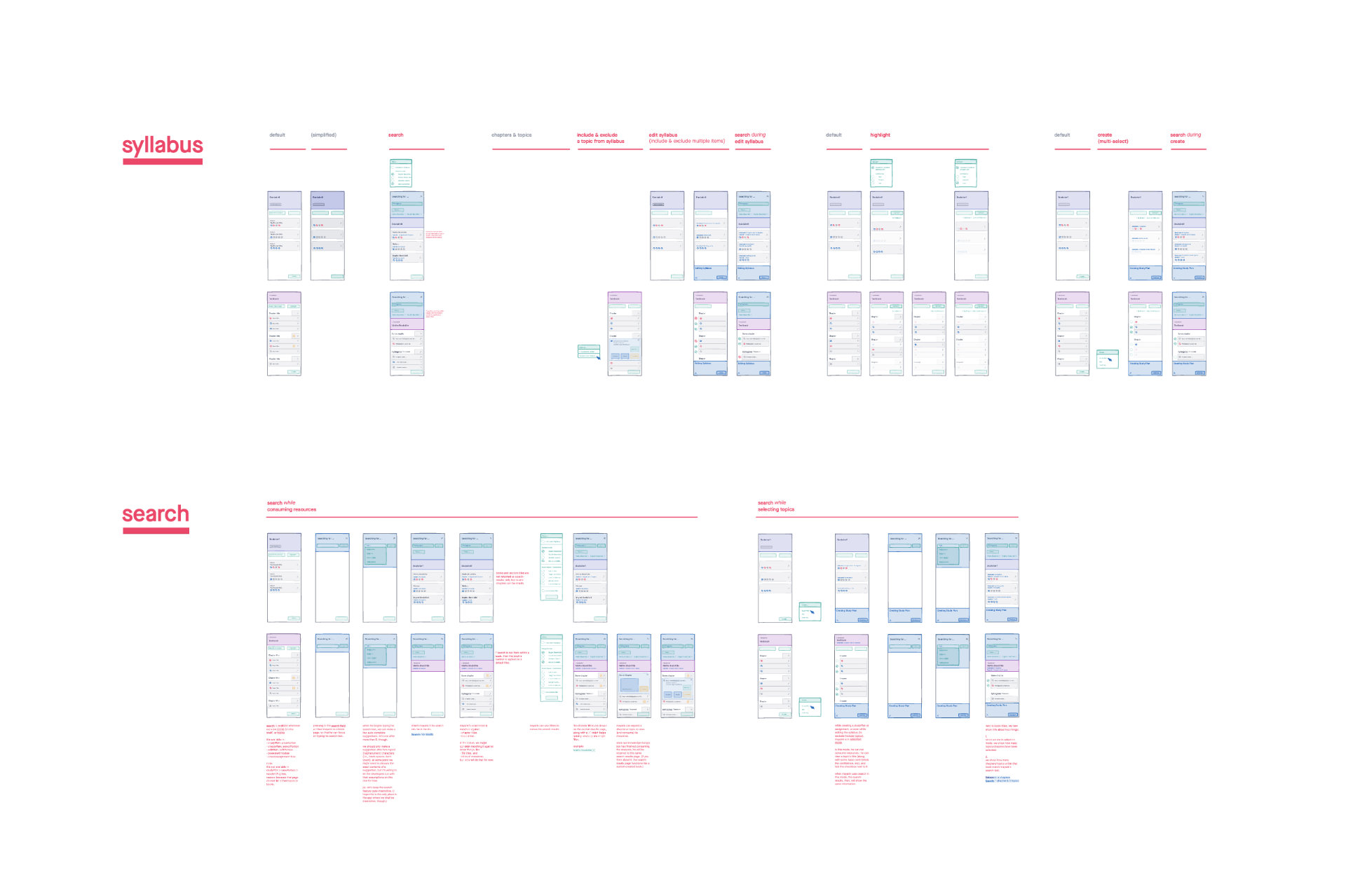
wireframes: features and components.
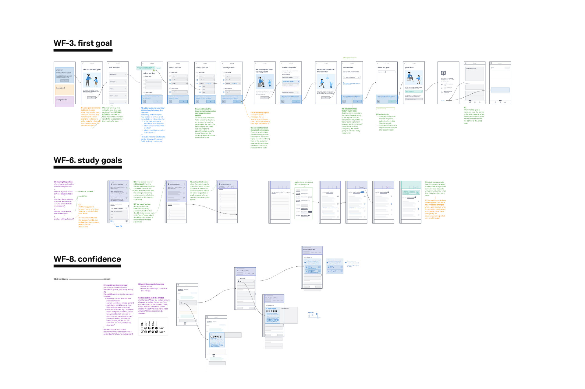
flows: interaction and behaviour.
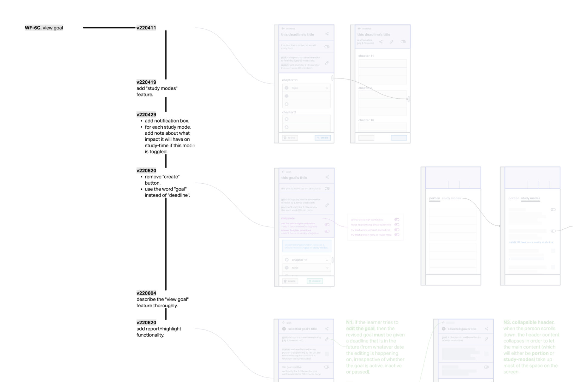
changes and versions.
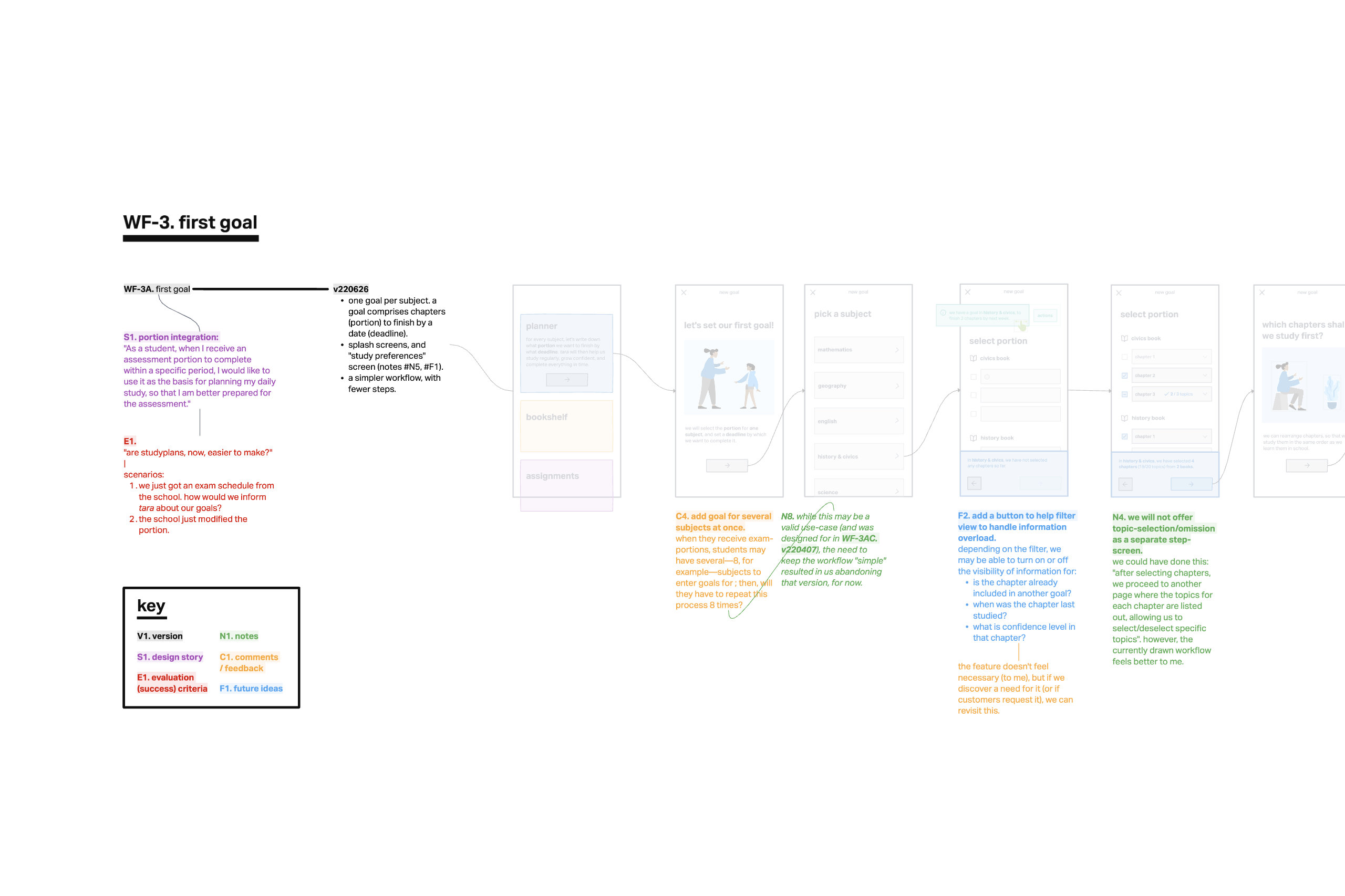
annotations: stories, feature-notes, feedback, future-plans, and success criteria.
—
prototyping fidelities
we contributed to every stage of the design process, from scoping to production. along the way, we built a design library for prototyping, and invented a highlight/select tool (which replaced search, sort and filter—at once—; and, helped us report5 a child’s progress without showing any graphs, charts or numbers).
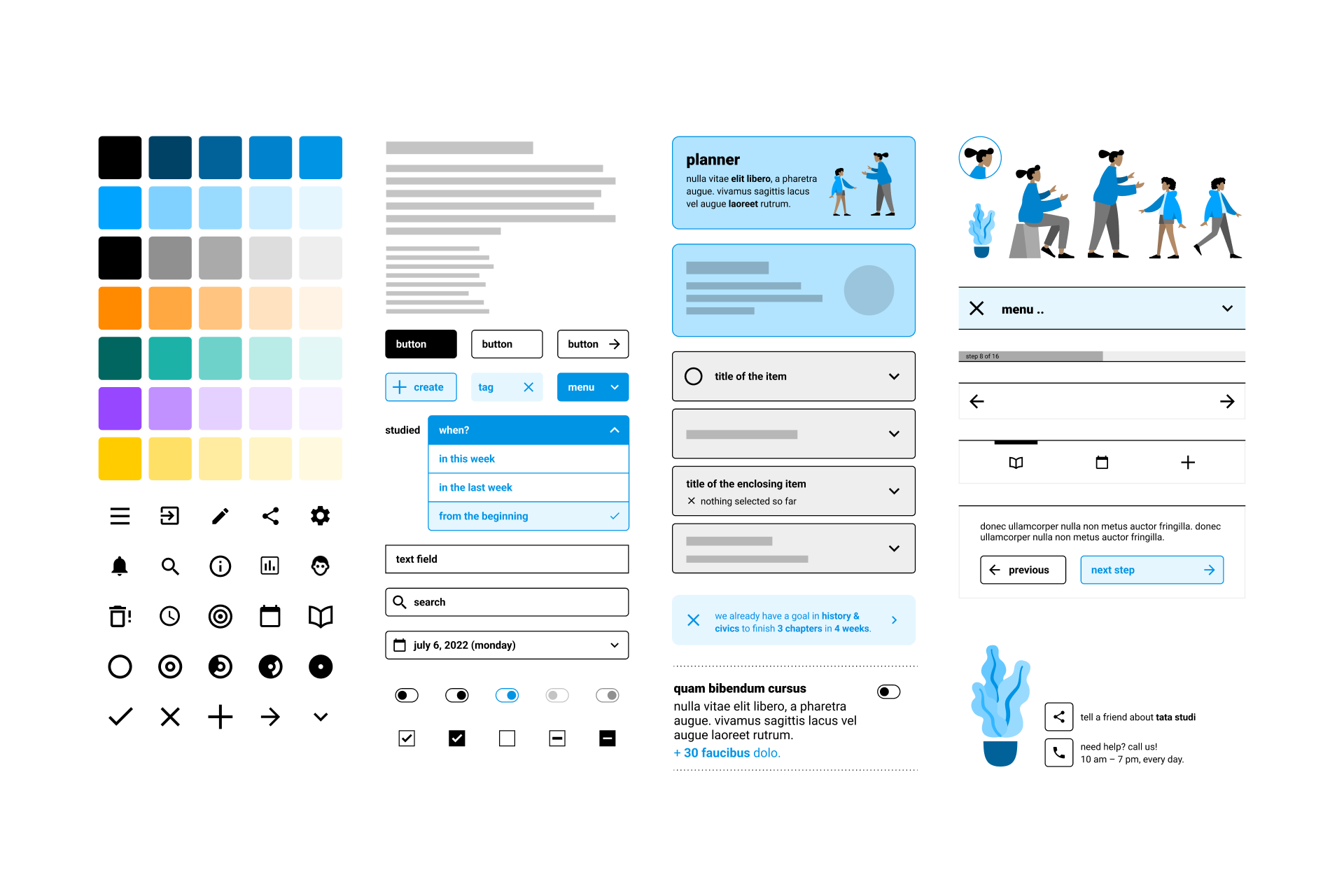
a design library for experience prototyping: to build quick-yet-believable demos, collect relevant feedback, and iterate through ideas faster.
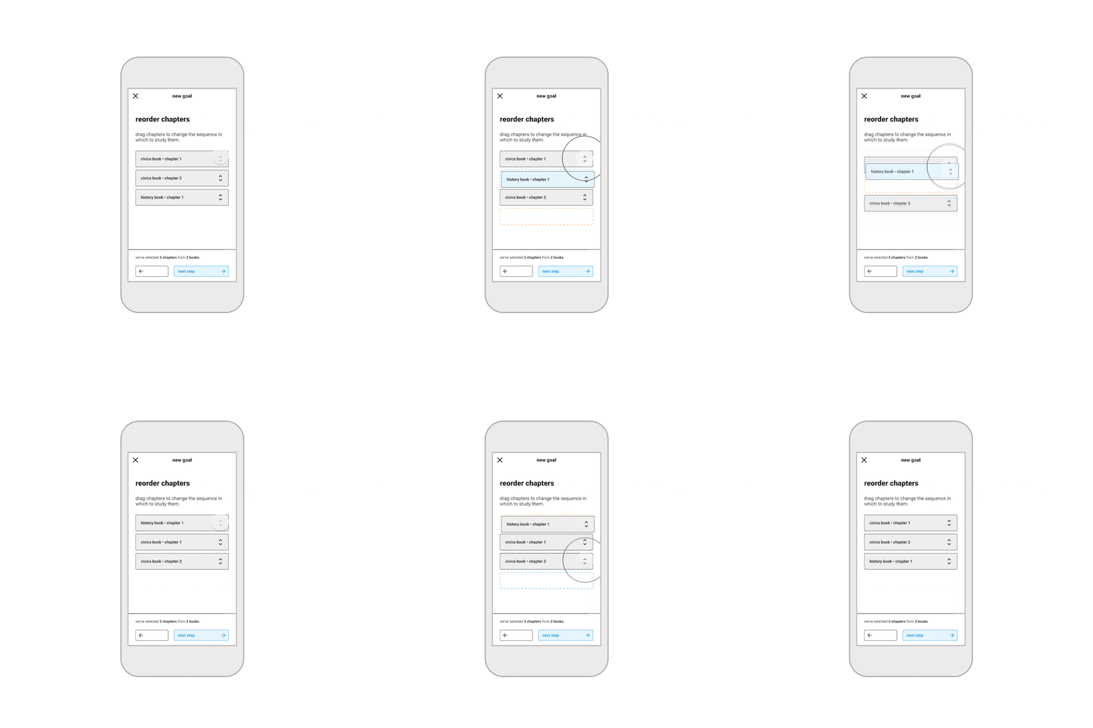
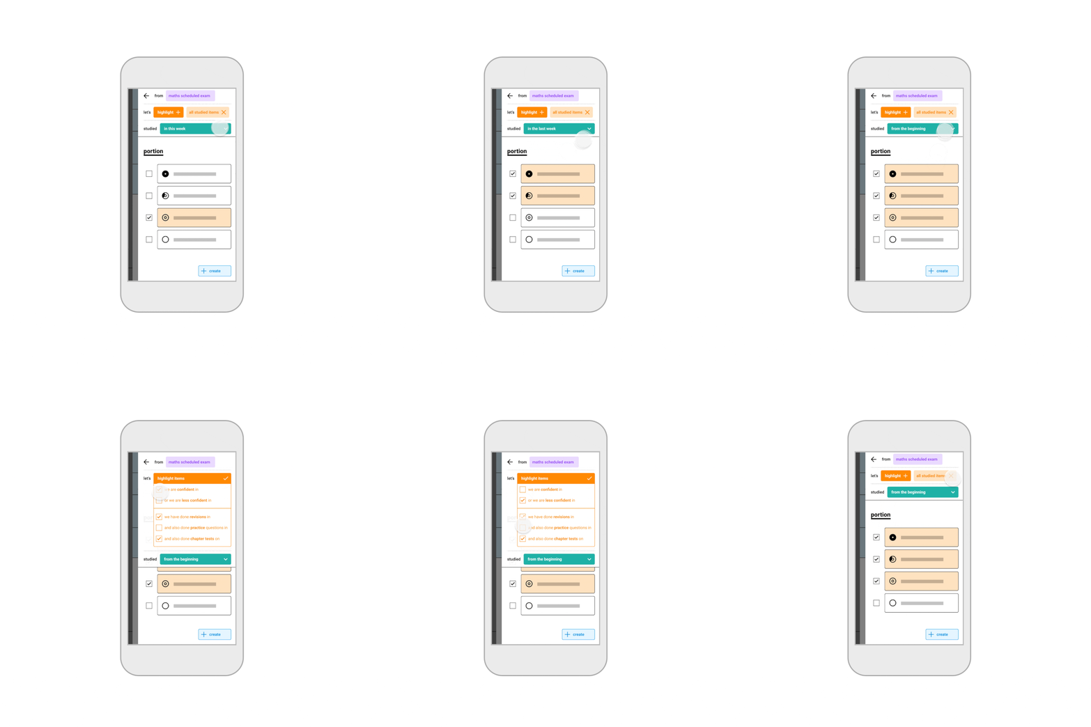
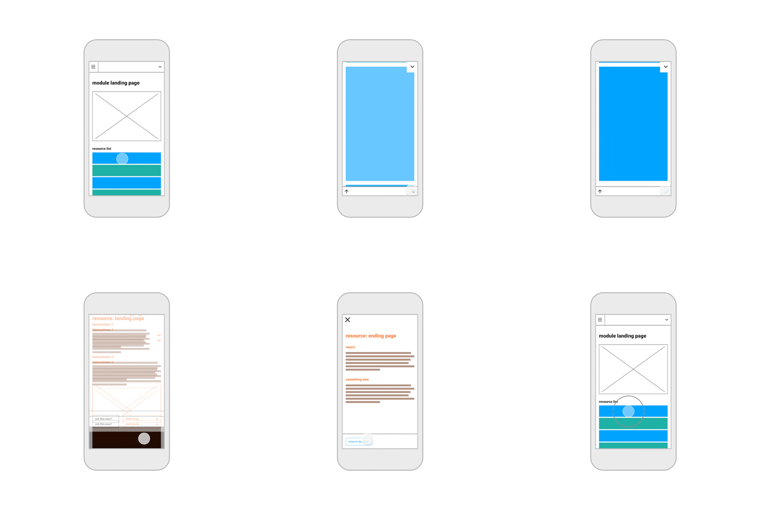
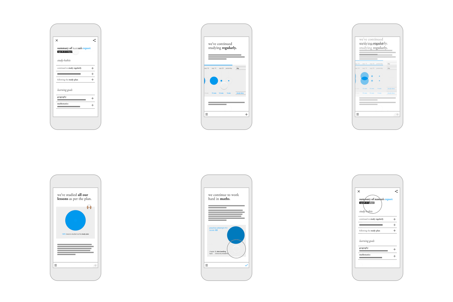
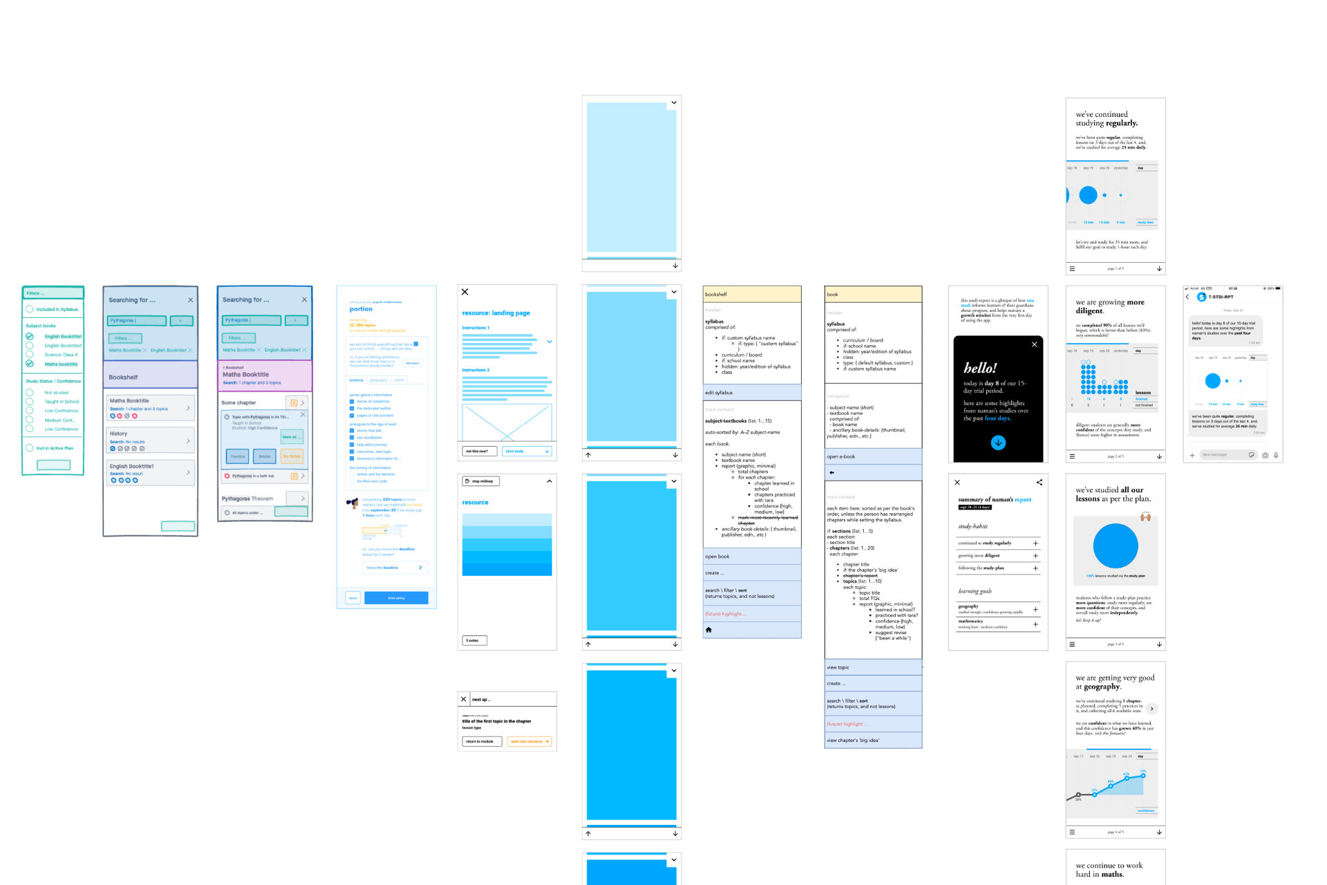
(from left to right) idea-sketches, functional prototypes, component diagrams, and experience prototypes.
instead of replicating real-world behaviour into an app, we invented something that didn’t exist in the real-world, and leveraged the digital interface to create a wholly new experience for parents and students.
—
colophon
work done: {{ you name it }}
functioning as: slowstudio
footnotes:
-
education should highlight an individual’s growth (eg. “you seem more confident in this chapter today than you were last week”) instead of comparing one student’s scores with another. features like topprʼs ‘leaderboards’ and xtramarksʼs ‘comparative performance reports’ likely exacerbate prevalent mental health issues (as described in this reuters article from 2014) facing india’s youth today. ↩ ↩2
-
while popular in duolingo and wordle, ‘streaks’ (in byju’s promotional material) seem like an unnecessary (and harmful) metric for a children’s study-app because they indirectly dissuade vacations, sick-leaves and non-study days. ↩
-
the conversation (between parents and children) can be about portions, assignments, study-strategy, confidence, progress, assessments, play-time, feelings, expectations and aspirations, etc. it is often transactional, and frequently involves negotiations. (eg. “if you finish two chapters—and, properly!—, then you can go down to play.”) ↩
-
the relational phrase ‘parents and children’ does not exclude ‘guardians and their wards’. (i am using these terms functionally, and not biologically.) ↩
-
background reading: The UX of Making Student Assessment Data Useful (josh singer, 2021). ↩