covid-19 visualisation
designers presented covid-19 data to the public through maps, graphs, charts, and concrete scales1. these were usually accompanied by grievous words, policy instructions, and an overwhelming flood of numbers.
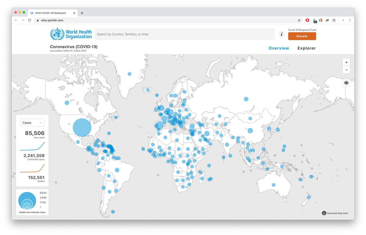
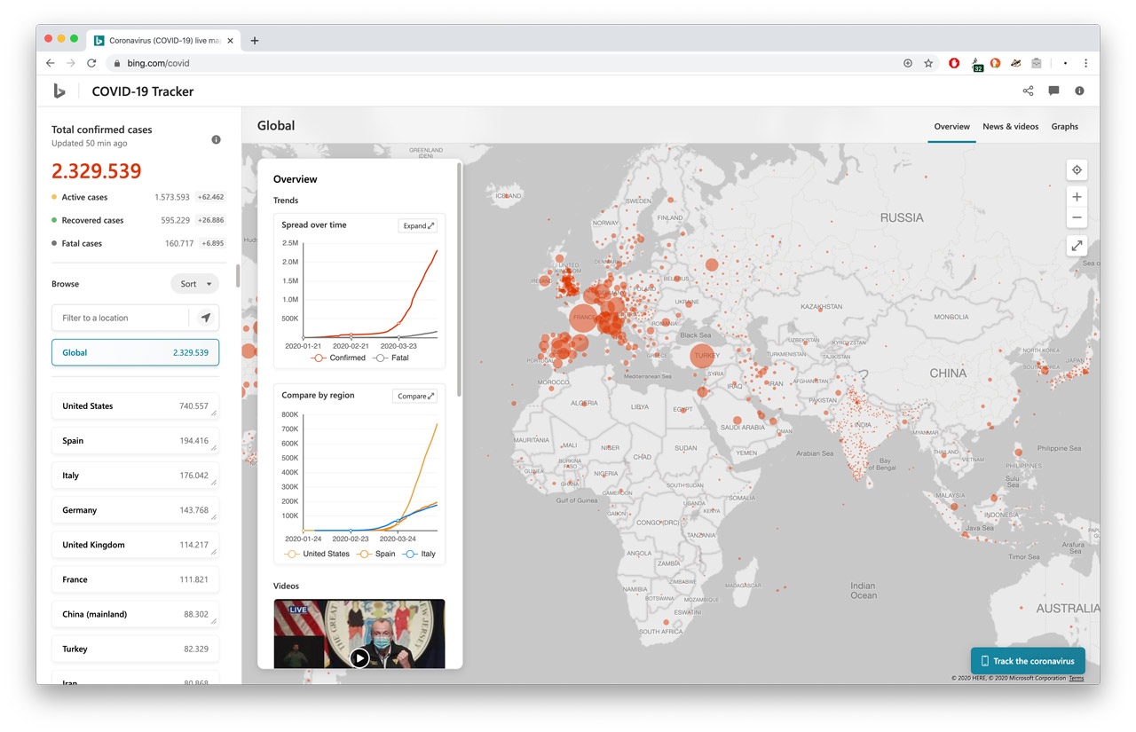
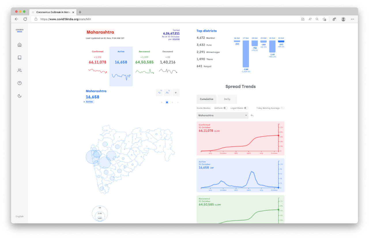
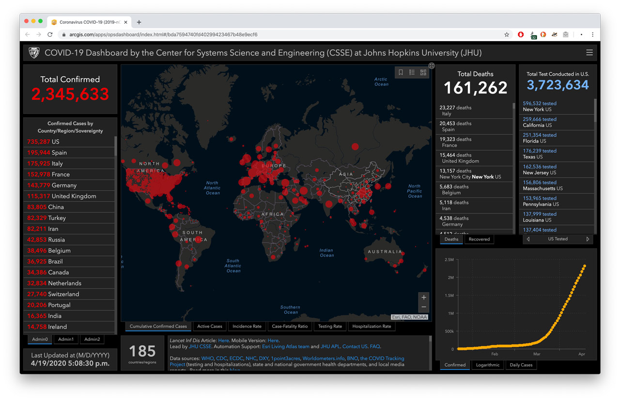
tap on the image to see more examples. • this image: world health organisation.
as the pandemic progressed, these visualisations were refined in style2 and form3, and likely proved useful for policy-makers and administrators. however, none of them seemed to answer questions from a typical person’s point of view , like so—
“what do these numbers really mean, as i go about my daily life ?”
we wondered—
covid-19 may be terrifying, but can we discuss it without spreading panic and grief? if numbers are overwhelming, do we really need to show them? instead of instructing (schooling) populations, can we empower (educate) them to do what’s right? how may data grow more relatable? can our visualisations be conversational? can we stop capitalising on peoples’ fears and attention, and produce kind work instead?
so,
we made this sketch:
this visualisation shows how widespread covid-19 is in a group of 10,000 people in {note}.
a — is you. (can you find yourself?)
A — is an infected person.
now,
if you
feel unwell,
please
isolate at home and seek medical help till you recover.
socialising
would bring you in contact with a lot of people, and may help covid-19 spread more easily.
if you absolutely must
move-about
for the sake of your livelihood, please act responsibly, and follow covid-19 guidelines.
functioning as slowstudio
working with: rohit sharma
data sources: covid19.who.int, data.worldbank.org
assets: weepeople font
essay drafted over 2020·03–06, at the start of the covid-19 pandemic. rewritten and published (two years later) in 2022·11.
footnotes:
-
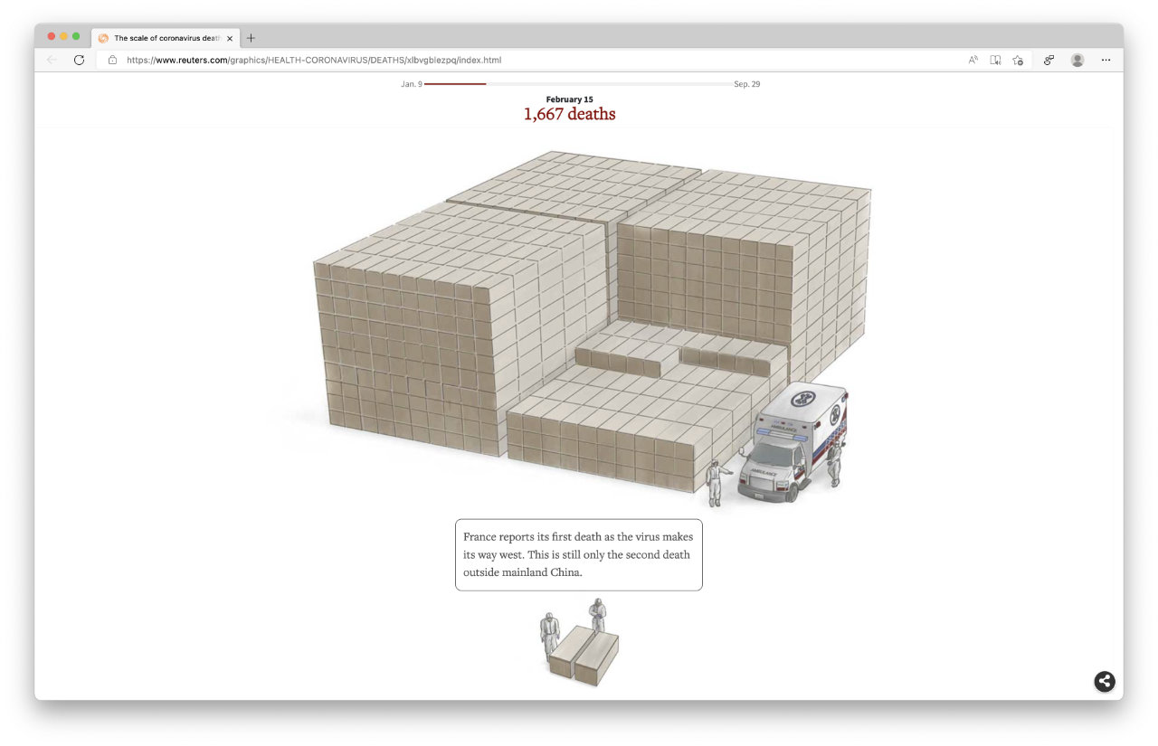
when manifesting extreme magnitudes or unfamiliar units, designers create concrete scales to help “relate, re-express [by referencing familiar concepts], and compare them through visual depictions using magnitudes and units that are easier to grasp”. i’ve collected some examples of concrete scales in this essay on data manifestation. ↩
-
an example of improved style:
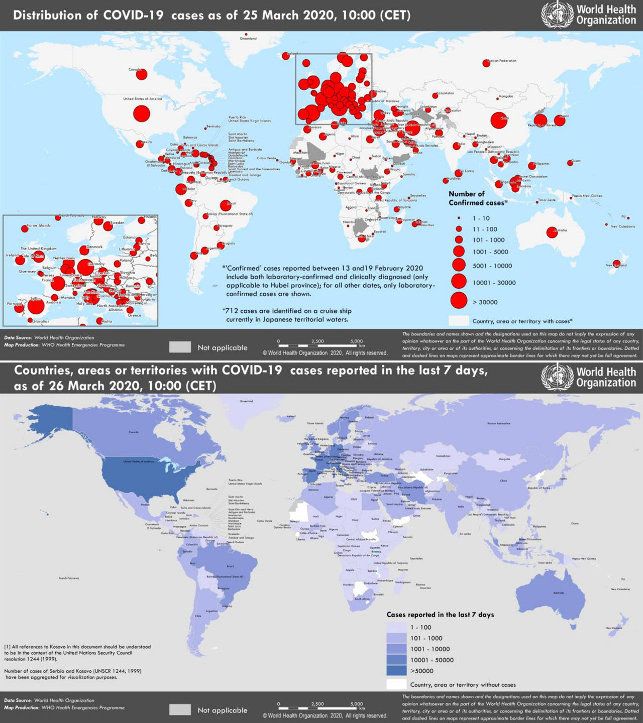
in their daily situation-reports, the world health organisation started using blue instead of red-colour, on their maps, on march 26, 2020. ↩ -
an example of improved form:
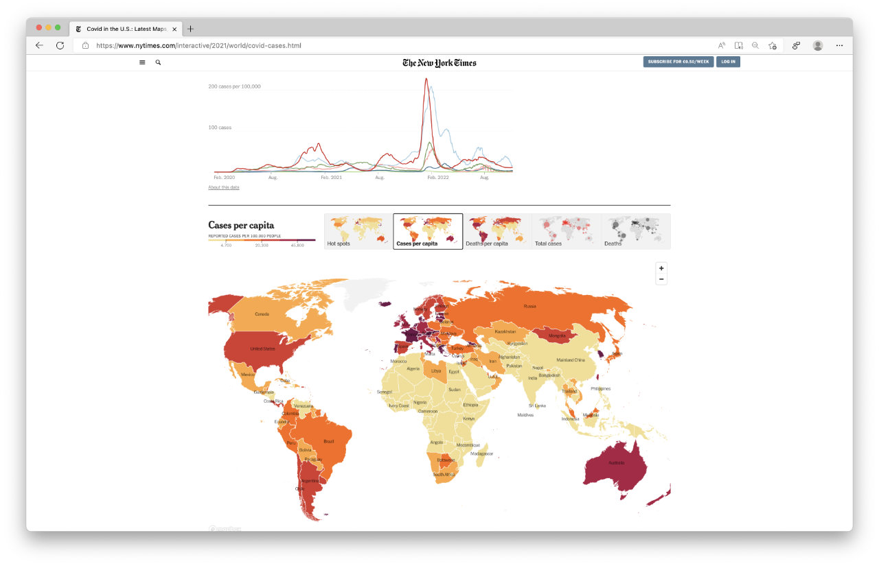
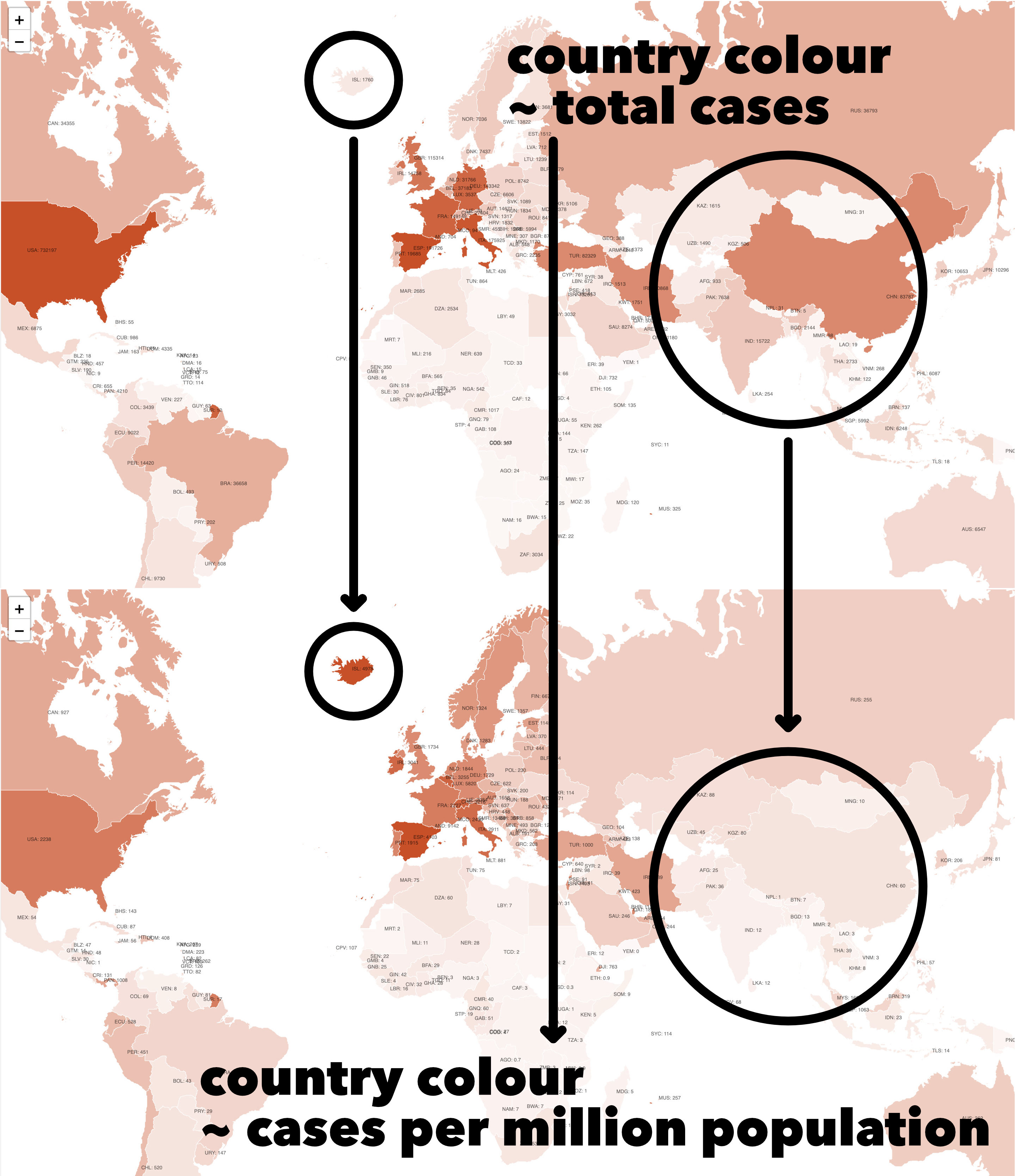
2000 ‘total cases’ means very different things in iceland and in india, because both countries have vastly different population baselines. when showing the spread of covid-19 in different countries, media outlets persisted with reporting ‘total cases’ for several months (perhaps because those sounded more dramatic, and grabbed more eyeballs) before eventually shifting to reporting ‘cases per million people’. this image shows how this change in the data’s form affects how it is interpreted. ↩