on data manifestations
on effect and affect
luke dubois (2016):
data visualisation. when you do it right, it’s illuminating. when you do it wrong, it’s anaesthetising ; it reduces people to numbers.
me (2021–22):
there’s a difference between communicating data effectively versus doing so affectively. designers do not exist to serve or ingratiate data : heck!, our work may not even present the data, as long as it somehow succeeds in affecting emotion and behaviour.
nadeem haidary (2009):
Much of the knowledge and statistics in the world exists in places like books, newspapers and web sites. You read things like “In Britain, 20 million tons [sic] of food is thrown out each year.” Statistics like these may be striking when you first read them, but without context or placement in the physical world, they are rarely remembered and rarely change people’s behavior. What if this kind of information crawled off the page…
—
limitations of visualising data
even though data plays such a central role in our lives today, few people are literate enough to engage with it, and 2d data-visualisations seldom produce lasting affect in audiences who have grown numb due to overexposure to a precision-engineered stream of attention-hogging visual artefacts.
hence: to make our data memorable (and thereafter affect behaviour change), it wouldn’t hurt to sometimes pull data out of 2d-media ; to manifest and situate it in the real world ; so it may be experienced more holistically.
—
what data can help us do
data can help us inform people: elucidate, educate, put-forth an interpretation, highlight a problem, support a solution, or merely invoke curiosity. it may also be provocative: to express skepticism, pose a question, or challenge a norm.
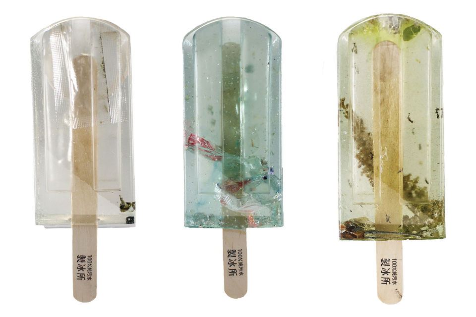
samples of water collected from urban rivers, creeks and ports were frozen in moulds and preserved in resin. “We hope when more people see this they can change their lifestyles,” one of designers said.
info: theguardian (2017)
communicating the importance of social distancing during the covid19 pandemic.
info: the ohio health department commissioned this video in 2020, and the washington post and cleveland wrote about it.
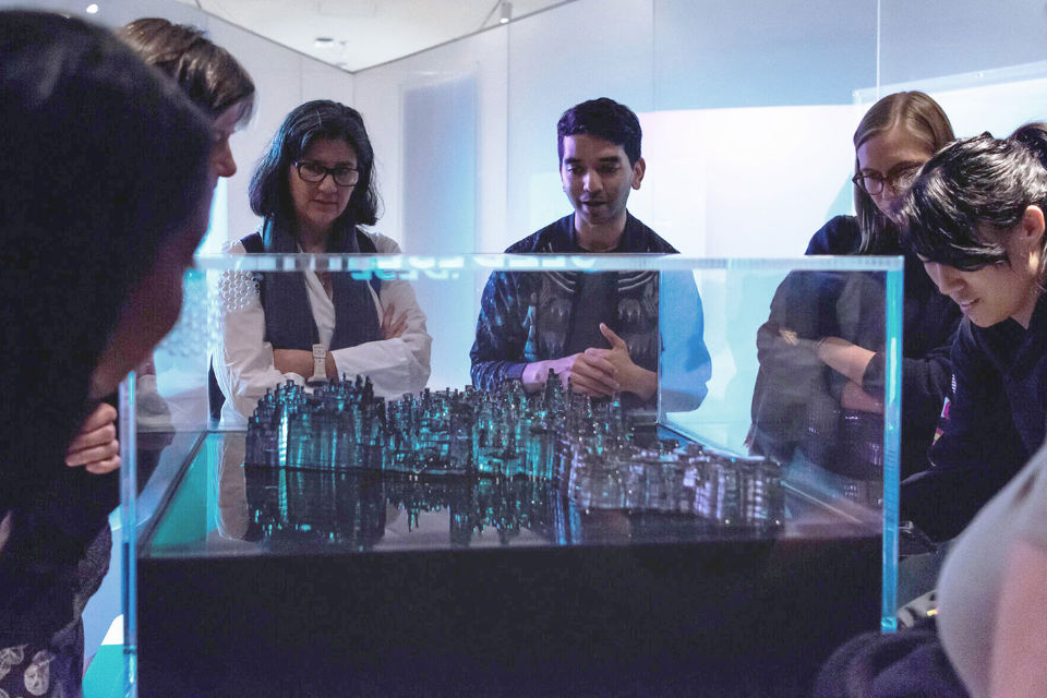
Ekene Ijeoma’s ‘Wage Islands’ (2019): this interactive installation submerged a topographic map of new york city, leaving behind only those places their wage may afford to rent, revealing inequalities in income and housing-costs.
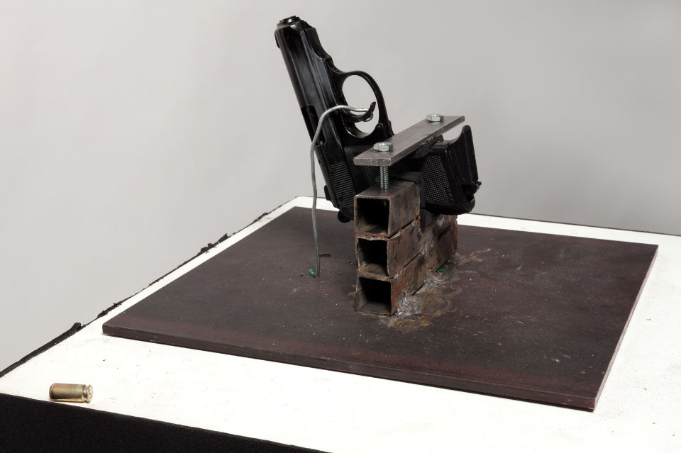
luke dubois’s gun fired whenever a homicide was reported in the city.
info:
'take a bullet for the city' (2014), test-firing video, tedtalk (2016), exhibited at jonathan ferrara gallery (2014–15).
—
what manifestations can help us do
data manifestations may work as hooks, to draw people into an unknown or less-considered topic, or as reinforcements, to bolster conversations around a known topic. they may also help study data, see it in new light, and discover patterns in it.
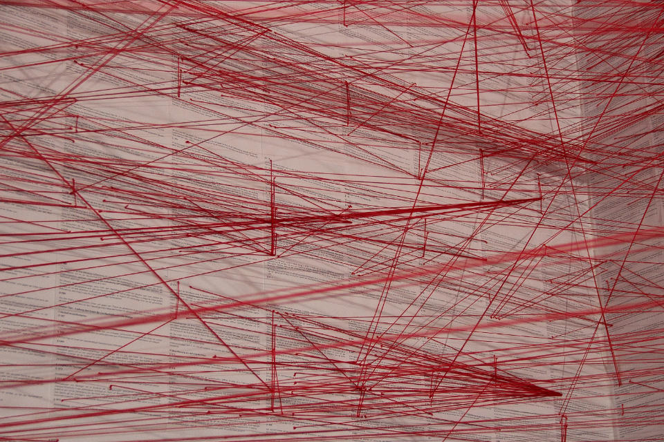
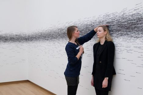
A room-filling visualization that illustrates the patterns of references—and, hence, the complexity—within the German civil code. Every paragraph is pasted on the wall, and Each red thread stands for a reference from it to another paragraph.
info: ‘Network of the German Civil Code’ (2013) by Oliver Bieh-Zimmert. as seen on dataphys and visual-telling in 2022.
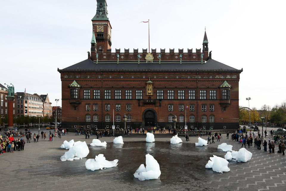
to raise an alarm about the rapid loss of polar ice (caused by human-induced climate change), Olafur Eliasson and Minik Rosing transported an iceberg from the arctic, and let it melt at City Hall Square, in Copenhagen.
see: Ice Watch (2014).
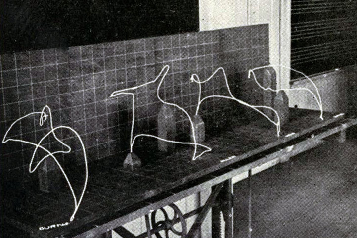
3D wire models of hand motion paths ("chronocyclegraphs") created from time-lapse photographs. used to study and teach human motion.
info: Frank Gilbreth's Wire Models of Factory Worker Movements (1915). as seen on dataphys in 2022. regine debatty (‘we make money not art’) also wrote about this (in 2012).
—
how data manifestation’s come to be
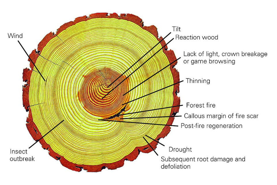
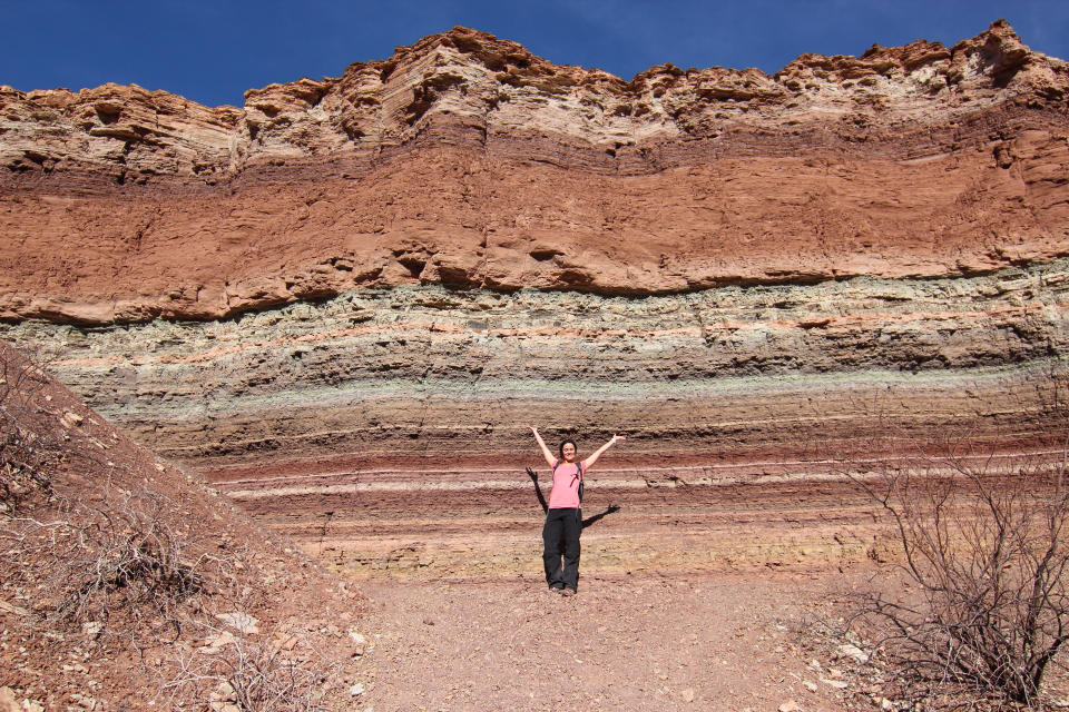
there exist naturally-occuring forms of data manifestation, like tree rings and rock strata. more often than not, they manifest time.
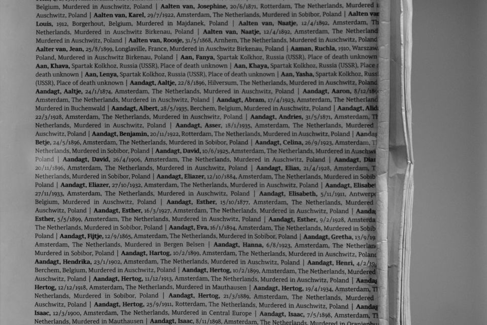
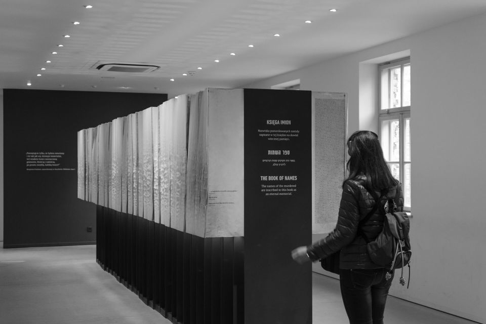
sometimes, flat representations incidentally (just happen to) manifest beyond two dimensions. ‘the book of names’ at auschwitz, which i visited in 2019, is one example of this.
at most times, however, we intentionally go-about manifestating data. let’s look at one example:
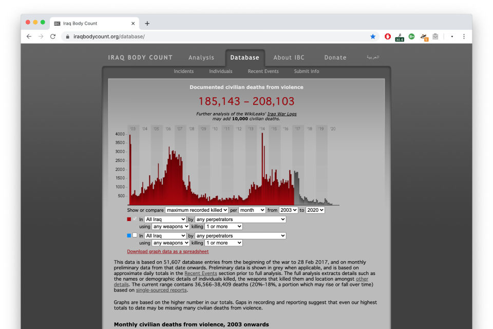
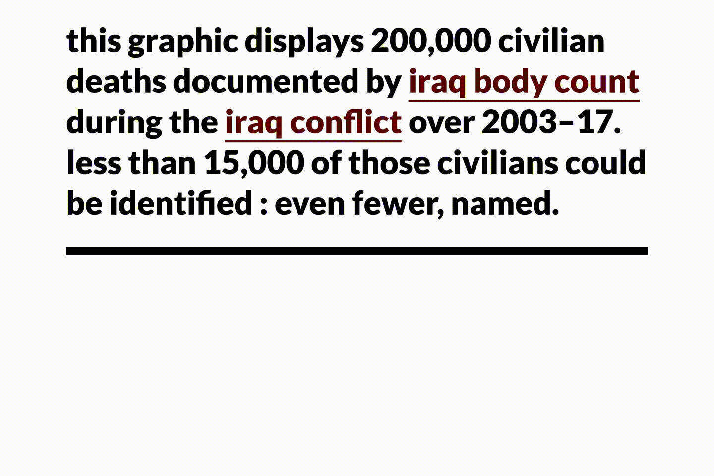
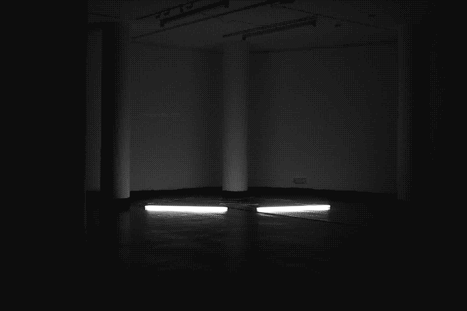
iraqbodycount meticulously documented civilian deaths caused by the 2003 american invasion of iraq for well-over a decade. names of the deceased could have been stored in a table or book, and were usually presented as a bar-graph on their website.
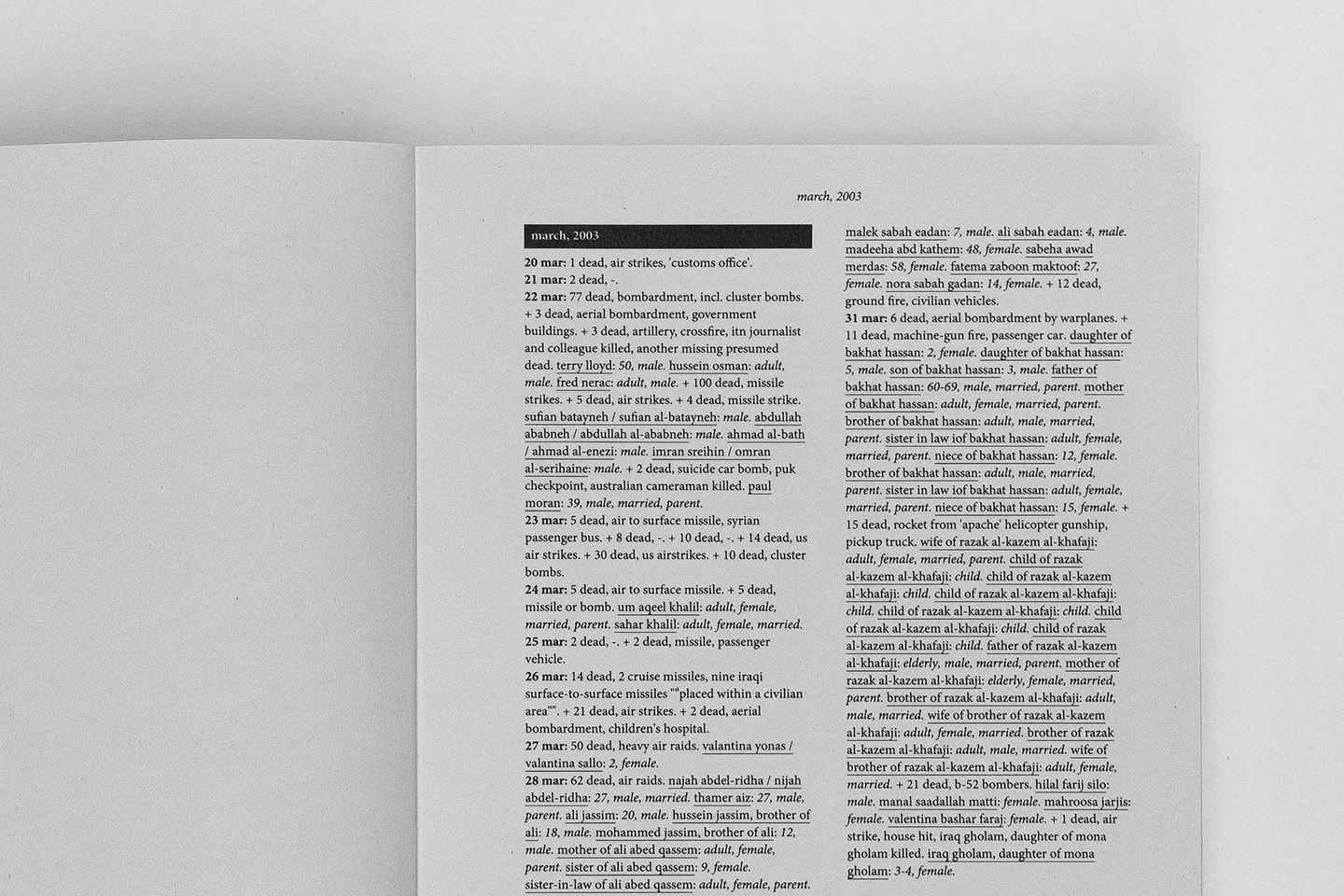
i portrayed this data as a stream of blood on a webpage (2020) ; this was a moving, yet flat, representation. in order to pull it out of the screen, the data was manifest using tubelights, showing how ‘every life lost is a light going out from this world’ (2016).
—
attributes of manifestations
manifestations can be: literal, abstract (using numbers, graphs and charts), referential, or metaphorical.
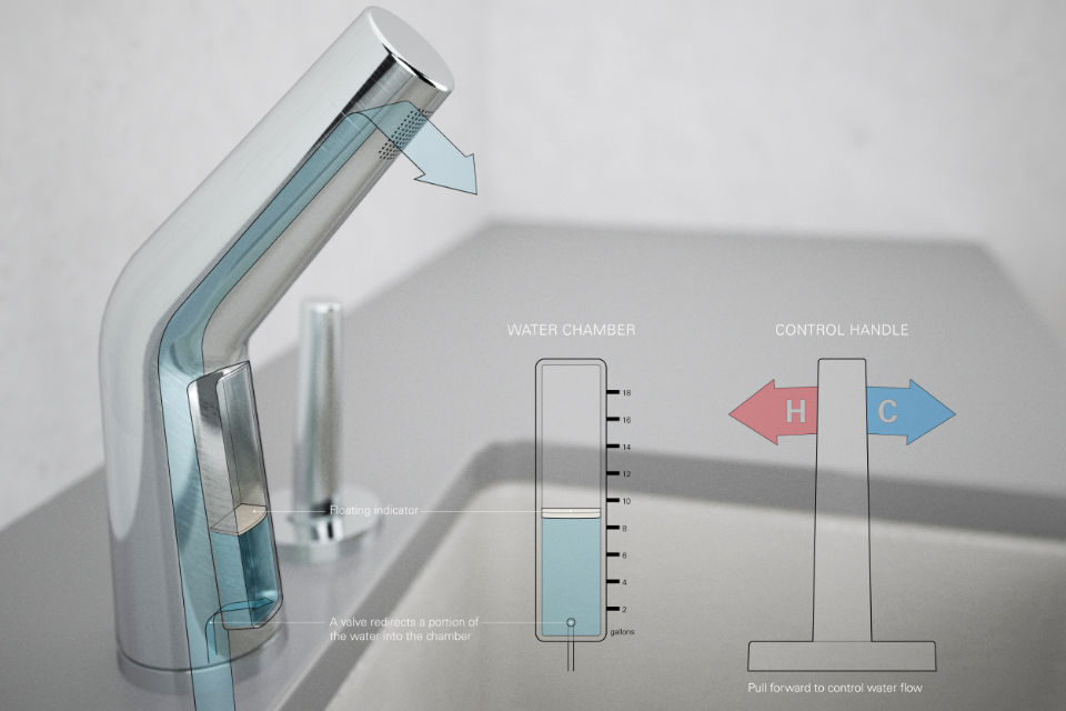
a faucet that visualizes (quite literally) the amount of water consumed when it is used. this was made as part of nadeem haidery’s ‘in-formed’ project in 2009.
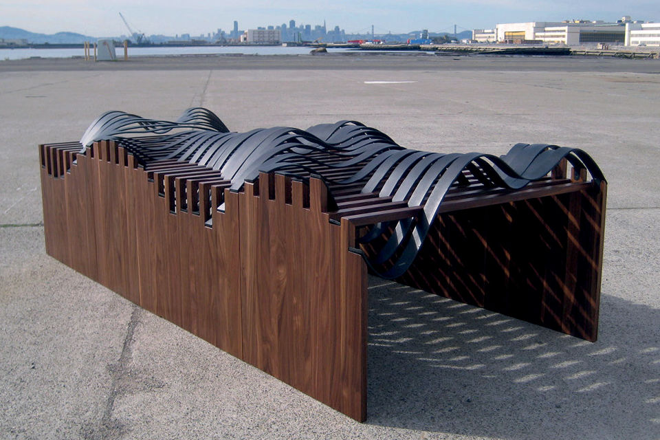
manifesting tidal range as steel graphs in a wooden frame :adrien segal's tidal datum series (2006/2011).
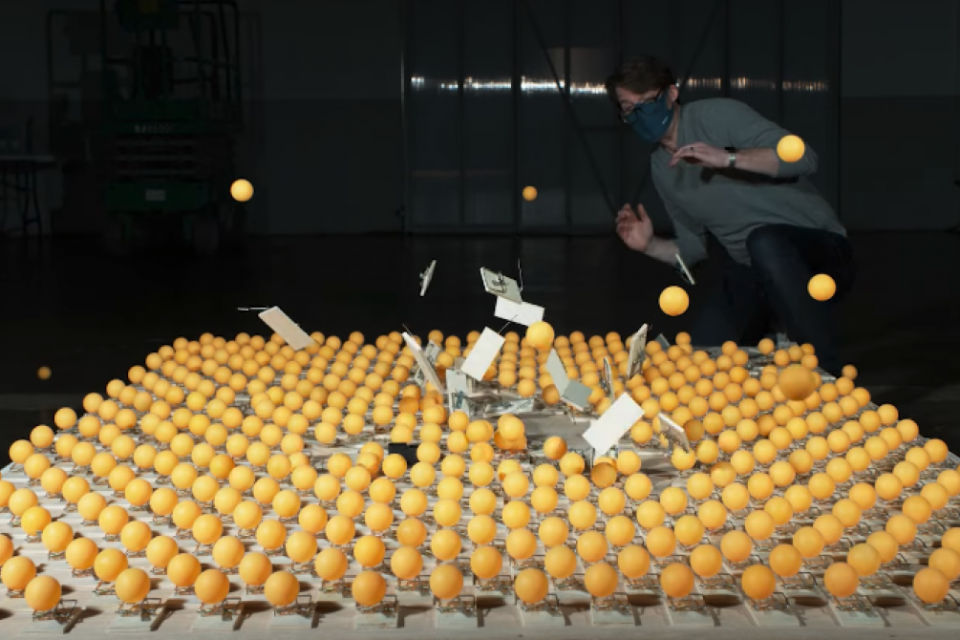
joe hanson referred to people (and disease) using table-tennis balls (and mousetraps), while explaining how vaccinations help contain the spread of covid19 (2021).
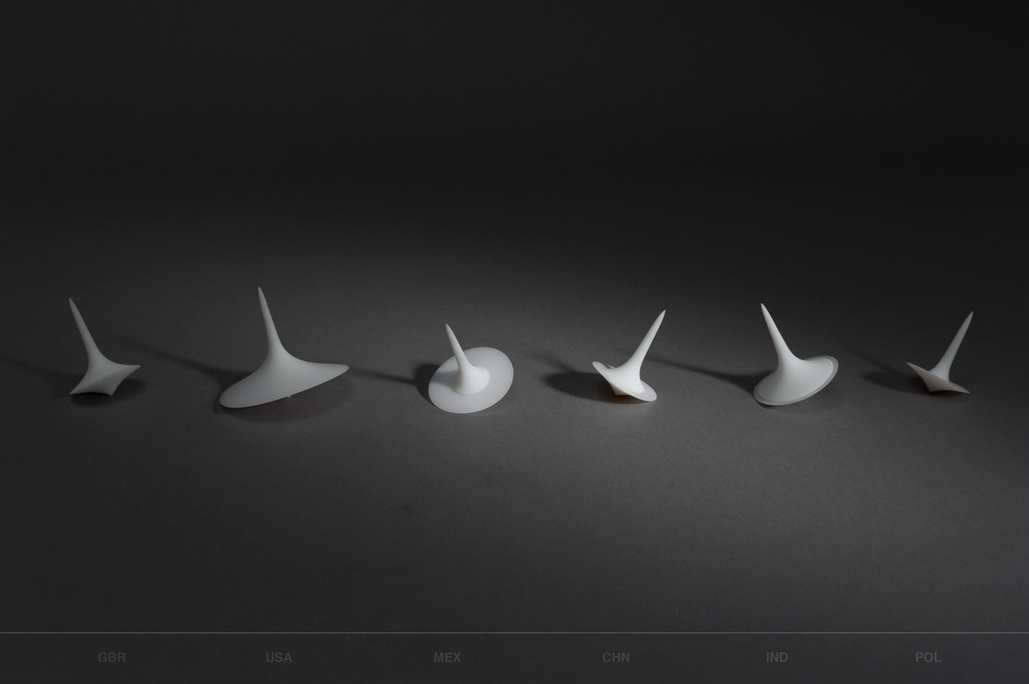
spinning-tops as metaphors for the continuous migration of peoples in-and-out-of countries: a top represents the number of immigrants (upper half) and emigrants (lower half) for each country. we made these in a workshop run by karin von ompteda (in 2014).
when manifesting extreme magnitudes or unfamiliar units, designers create concrete scales to help “relate, re-express [by referencing familiar concepts], and compare them through visual depictions using magnitudes and units that are easier to grasp”.
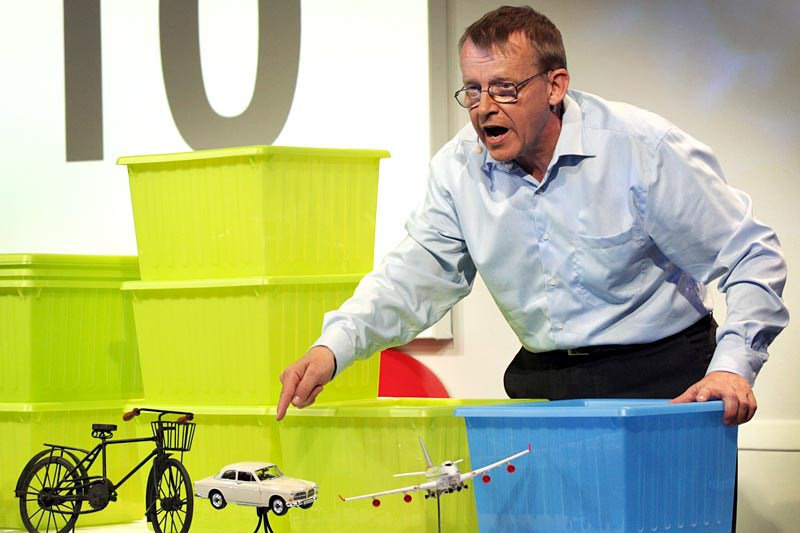
hans rosling’s 2010 ted talk on global population growth, where he used buckets to represent population-volumes. also see: links to all his talks on dataphys.
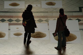
Each grain of rice equals one person in ‘Of All The People In All The World’ (2004). i came across this project on dataphys.
as designers, our goal is to make data relatable. most of the work produced for this is visual and on two-dimensional surfaces (and that’s okay). sometimes, we do physicalise the data: we make it tangible, textured, touchable, pickupable, whathaveyou. however, our work may just as well be acoustic, olfactory (and edible), liquid or gaseous, felt as heat or pressure, or something else altogether.
the term ‘data physicalisation’ is quite popular while describing such work (see: dataphys). but since we can employ a wide-range of media (and modalities) that comprise a person’s lived experience in our work, i prefer calling it ‘data manifestation’ instead.
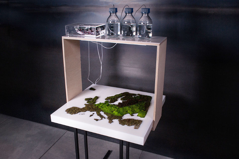
Sigitas Guzauskas’s Living Map, where moss grows proportional to the water it is given, to visualise rainfall. as seen on behance portfolio and on dataphys.
a sad song that plays more loudly if more people post sad tweets online.
see: ‘Twitter Tissues’, made by Polly O’Flynn & Henry Beech Mole in a workshop run by Karin von Ompteda and kevin Walker in 2013.

“Have you ever wondered what twitter tastes like?” :the proportion of different fruits in this smoothie mirrors how often those fruits are mentioned on twitter.
made by kat zorina, Ruben van der Vleuten and Kostantinos Frantzis at ciid in 2012.
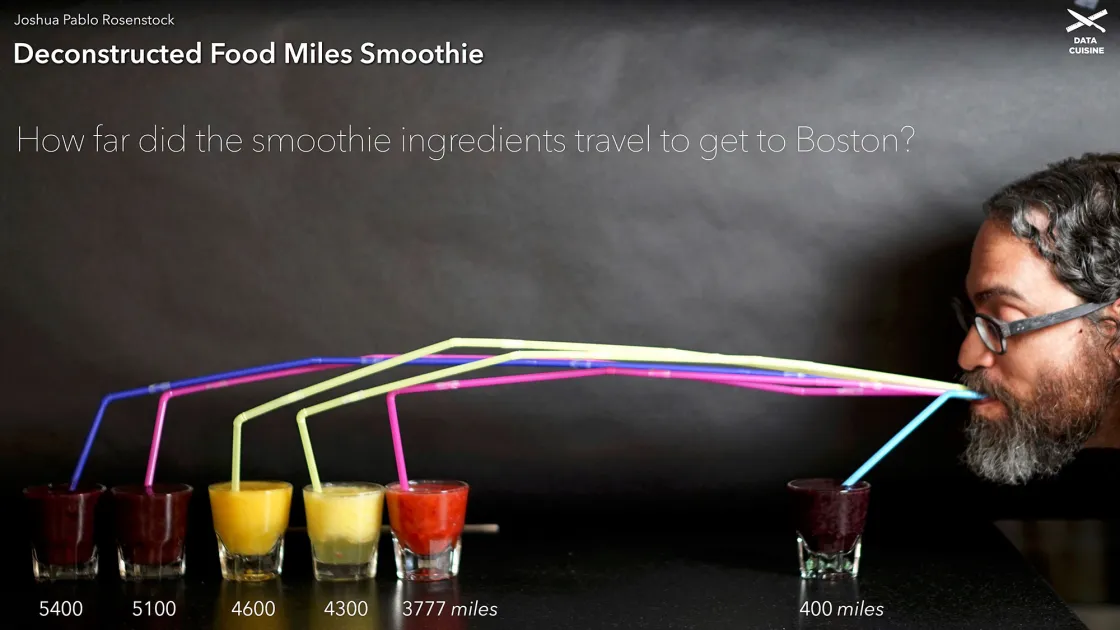
“how far did the smoothie ingredients travel to reach boston?” :made by joshua rosenstock at a data cuisine workshop in 2016.
side-comment: most of the work produced in these workshops is still ‘a flat data visualisation (usually a bar graph), using pixels of food’. while well-presented, it produces very little affect. i look forward to stronger work in the years to come, though.
we may produce an object, fill a space, stage a performance, design a participatory experience, or do something else.
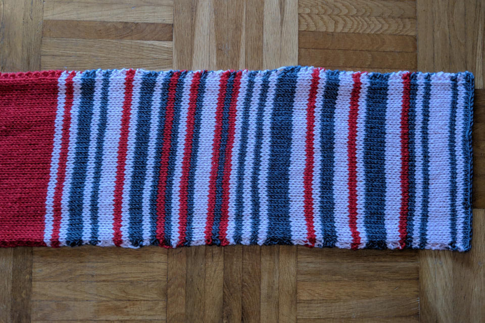
making an object: Sara Weber’s mother knitted a scarf during her daily train rides to work in Munich, and used different colors depending on the amount of delay. (Sara tweeted about it in 2019, and i read about it on dataphys.)
turning sentiment data from text-chats into a performance, as part of my collaboration for expression project in 2015.

in 2020, Todd Linkner designed a breathing device (object) and a workshop (participatory experience), to help people understand an asthmatic person's difficulty in breathing in deteriorating enviroments.
Roman Ondák’s ‘Measuring the Universe’ (2007) began as an empty white gallery, and invited people to participate by standing against the wall (and getting their heights marked).
how may our manifestations behave?: they may be fixed, active (changing or moving in a predetermined sequence), reactive (to the audience, or to a data-stream, or something else), or interactive ; they may even be ephemeral.
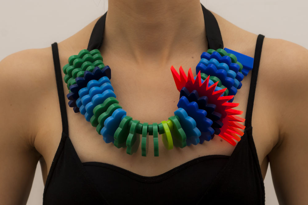
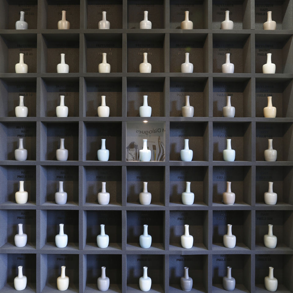
3d-printed necklaces showing one week of air-quality data, in ‘touching air’ by Stefanie Posavec and Miriam Quick (2016). “The necklaces sit heavily on the chest, mimicking the physical burden that air pollution places on the heart and lungs.” also seen on dataphys.
a light goes out to mark every civilian-death following the 2003 american invasion of iraq, in a predetermined sequence (using historical data), in thecostofwar (2016).
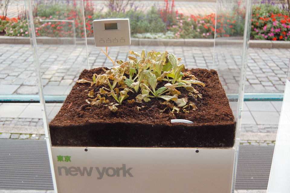
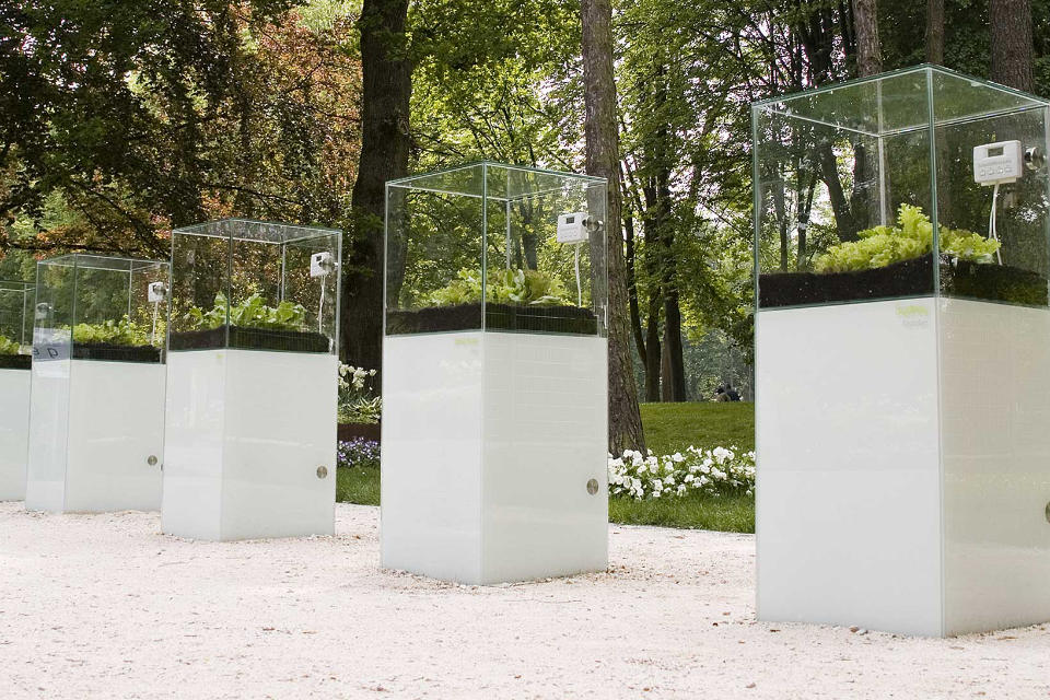
a lettuce plant placed in a box, representing one major city on earth. the concencration of ozone in the box, which changes in real-time to reflect the pollution level in that city, affects the plant.
see: garden of eden (2007) by Thorsten Kiesl, Harald Moser, and Timm-Oliver Wilks ; described on dataphys, on kunstuni-linz.at (twice), in florian weil’s 2014 blogpost, and on wollle.at.
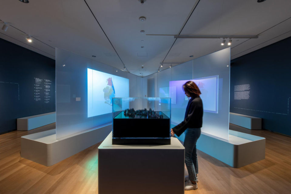
Ekene Ijeoma’s ‘Wage Islands’ (2019): once a visitor provided their wage, this interactive installation submerged a topographic map of new york city, leaving behind only those places their wage may afford to rent.
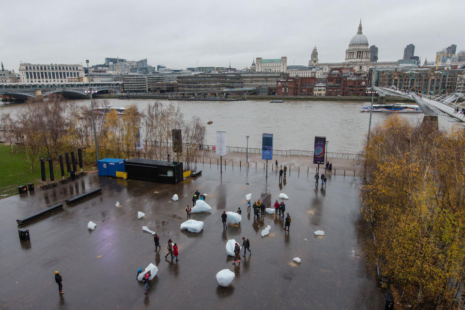
pieces from an iceberg, melting outside the tate modern in london (2018), to raise an alarm about the rapid loss of polar ice (caused by human-induced climate change). this piece did persist for a long time, in memory if not on the ground. see: Ice Watch.
we may start our work by looking at a dataset, but, ultimately, want to use this data to invoke a feeling of some kind in the audience ; we want to gift them a memorable experience, and invite them to engage with the data/topic at hand.
to do so, our manifestations may be quantitative or—in a manner of speaking—qualitative, or even perhaps something mixed. in other words, we may represent a statistic, or manifest the impact (emotional, or otherwise) surrounding that statistic.
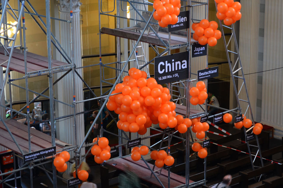
CO₂ emissions of twenty countries in 2014. Every orange ball equals 100 billion tonnes of CO₂.
info: dataphys recorded this project as made by Mario Klemm (who shared this video) and José Ernesto Rodriguez in a course ‘Data objects’ led by Boris Müller at Potsdam University of Applied Science in 2017.

“Flooding will become part of our everyday life unless we start doing something about our climate. According to the latest united-nations Climate Report, sea-levels are expected to rise up to 1 meter before 2100 if the global warming continues.”
info: tv2 denmark's ‘Our Earth our responsibility’ campaign in Copenhagen (2022).
“indians suffer up to ⅛ shorter lives due to air pollution” :manifesting this invisible loss in both, quality and volume, of life, through objects that surround us. (made by shruthi venkat in 2021, while working with me at slowstudio.)
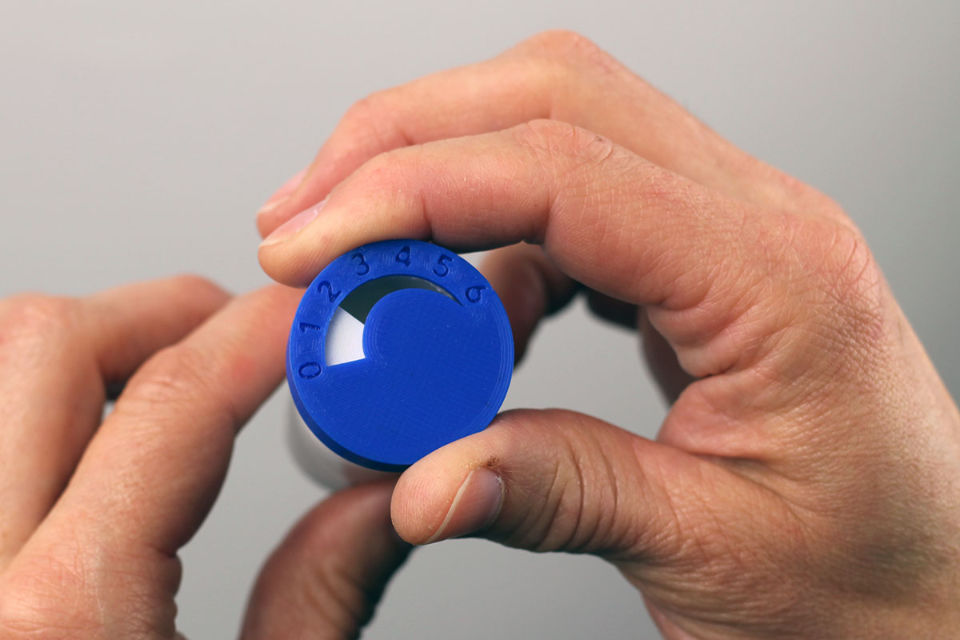
a breathing device (with a dial), which a person places in their mouth and breathes through. As the user turns the dial from 0 to 6, the device restricts airflow, simulating airway constriction similar to asthma. Todd Linkner designed the breathing device to help people understand an asthmatic person's difficulty in breathing in increasingly deteriorating enviroments.
our manifestations may be accurate or approximate, distorted or (over-)simplified, or even skip representing the data altogether. they intend to impart an affect, and we (as designers) are permitted some creative freedom while representing the data (as long as we are not dishonest).
think of it this way: what use is an accurate library-catalogue if no one visits libraries any more?1 designers may not be tasked with building libraries, but we are in the business of gifting people the motivation to read. i repeat— we’re not merely designing catalogues, shelves or entrances : we’re gifting affect.

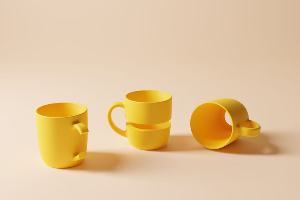
The fork shows caloric consumption for four countries. yes, the data here is simplified and approximated (after all, nutrition and consumption are complex topics), but the piece serves well to draw people into this topic and, perhaps, spend time talking about it on over a meal.
see: data-driven tableware, as part of nadeem haidery’s ‘in-formed’ project (2009). also seen on dataphys.
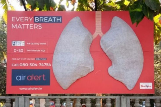
the lungs on this billboard started off clean, white, and gradually turned dark grey, to raise awareness about abysmal air quality (aqi) in the city. the discolouration of the lungs was not mapped to any data, and urban-dust may not even be the most important thing to highlight in aqi-conversations, but the installation did make effective use of imagery, material, scale, placement, time and repetition to create affect. Data about AQI was also presented in the digital display next to it. (photographed by Shruthi Venkat on Church Street, Bangalore, in 2021.)
we may distort ‘space’ or ‘time’ in our representations, in order to direct or pronounce affect. by distort, i mean things like shift, warp, scale (for example: enlarge or diminish space, and, elongate or compress time), conjoin, etc.
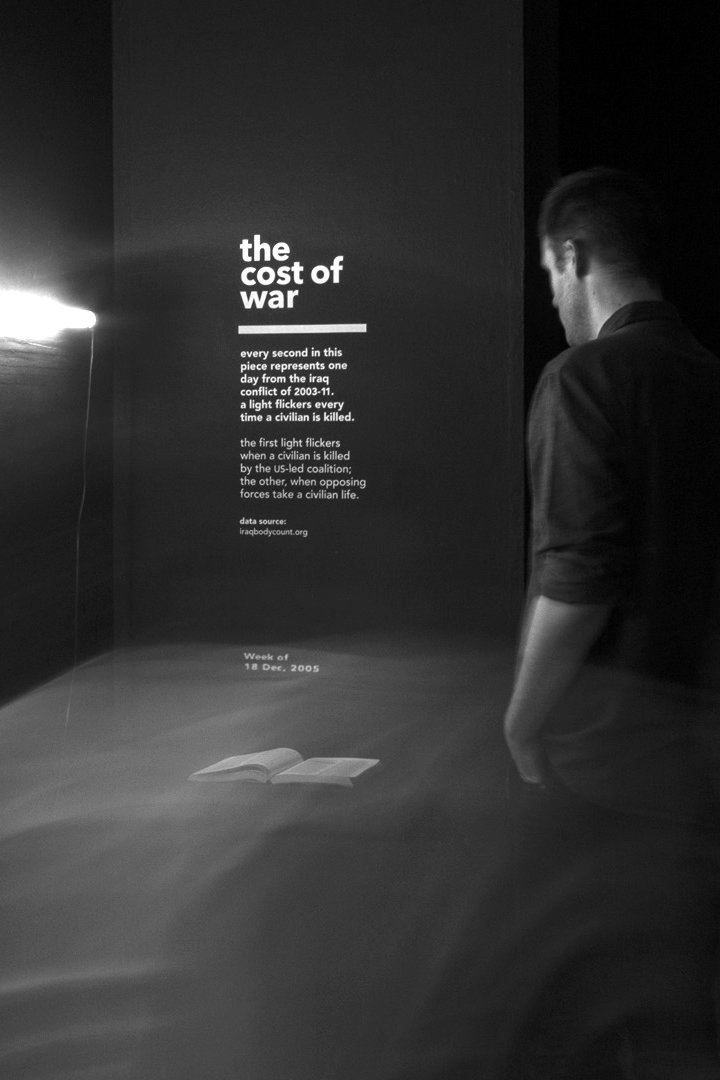
in thecostofwar (2016), i compressed time, playing-out eight years of data over one hour. i was happy to sacrifice temporal accuracy in order to gift affect to people within the short time they'd spend at the piece.

in their ‘Our Earth our responsibility’ campaign (2022), tv2 denmark displaced time and brought 2100's sea-levels to the present day.
besides distortion, we can also use scale and multiplicity to pronounce the affect our manifestations lend the audience.
scale: we made human-sized datasculptures for the worldexpo (2021), presenting data about sweden's stance on socio-economic topics like immigration, democracy, foreign aid, women in academia, energy, and sustainable forestry.
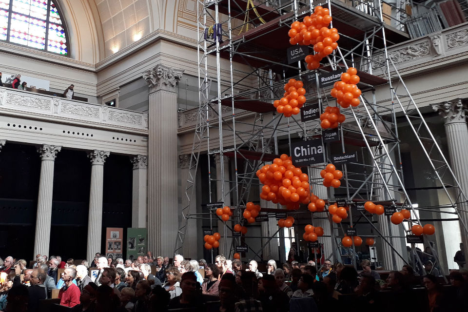
multiplicity and scale: 2014-data on CO₂ emissions of several countries towering above people. Every orange ball equals 100 billion tonnes of CO₂. (‘Datenobjekt: CO₂-Emissionen’, as seen in Mario Klemm's video, and on dataphys.)
we pay attention to context—cultural, geo-spatial, temporal, or otherwise—while manifesting the data.
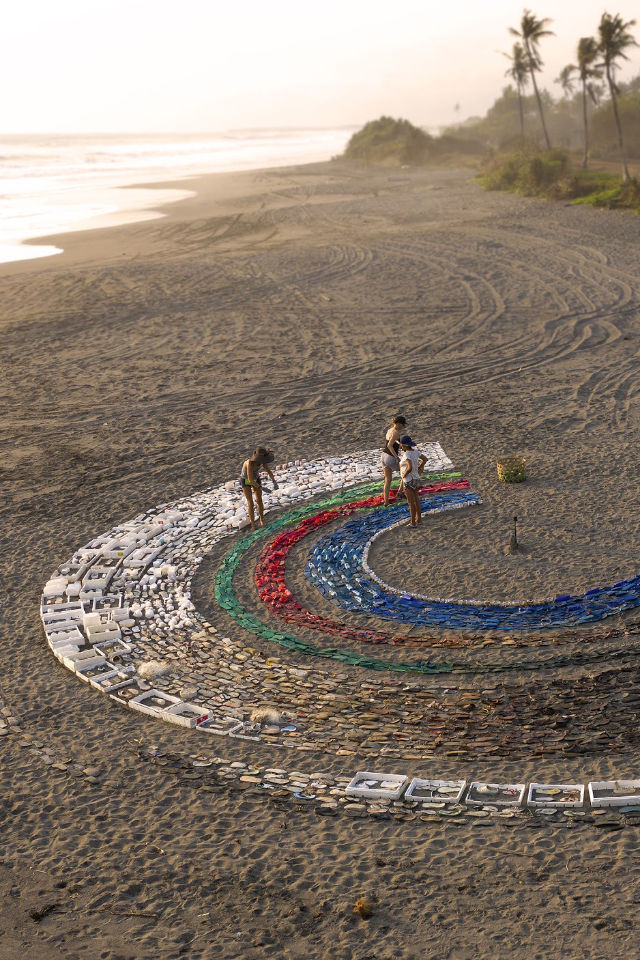
plastic that washed-up on bali's shores was arranged into a chart, to show what happens to plastic-objects after their first use. (you can read about this project on perpetual-plastic and dataphys, and watch eric ebner's video about it.)
in 2016, yijin huo used a ru porcelain vase—well-known in his culture to be of “the colour of the sky after the rain”—as a concrete scale to show the colour of the sky above beijing, in order to highlight damning air quality levels in the city. the project was also described on fastcompany.
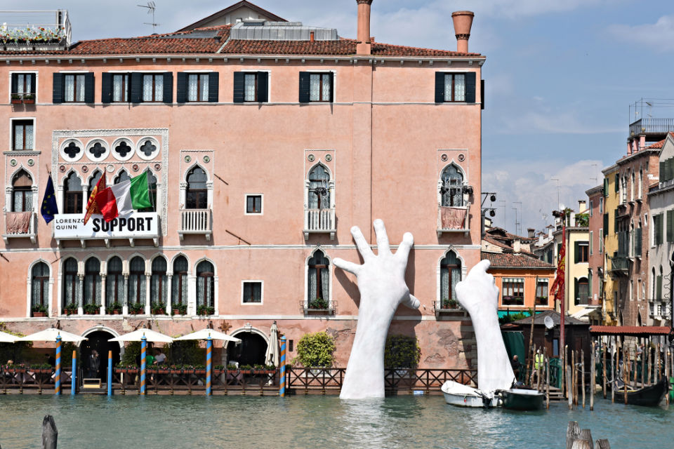
Lorenzo Quinn made this in Venice, in 2017, as “a stark reminder that the city is sinking”. bombay experiences flooding too, and will suffer due to rising sea-levels in the decades to come, but this piece wouldn't have worked as well there, because 'sinking' is at-best a seasonal feeling (in the monsoons), and not isn't yet a term people collectively use to describe their city. (one may argue that this is more a sculpture than a 'data manifestation' ; and it would be a fair argument. i do, however, refer to it as being both.)
where can our manifestations be placed?: on a table, in a museum or gallery, outdoors, in homes, be ephemeral, as a performance, in a dining experience, or, basically, in any-and-every context where a person experiences things. it may be a single piece, or a group of objects, or a sequence of experiences tied together by a common story.
like you see with experience design, there will be countless papers and projects which try to build-up theory about this (and that is fine), but no amount of theory can substitute sensitivity. spend time with the subject at hand, feel the data, take a stance, observe the context, discover what people relate with and value, develop a craft, believe in yourself :and good work will flow through you and manifest into the world. you can use theory to tune your work, but use your humanity to decide what to make in the first place.
—
thinking conceptually
at the end of the day, whether in written or visual or manifest form, and irrespective of finish, a design is only as strong as the content and concept it stems from. here are some prototypes made over 3 days, using paper and found/waste-materials, by my students in a data-manifestation workshop in 2022.
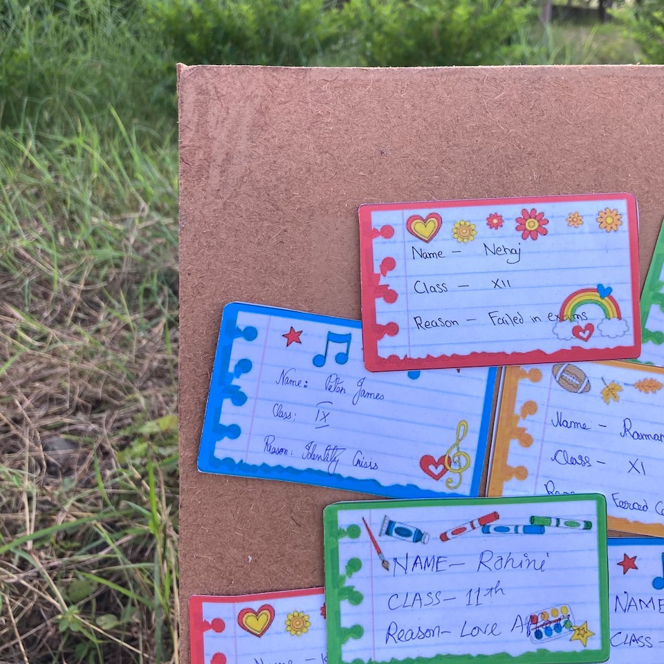
prachi raj tiwari: “13,000 school students died by suicide in india in 2021”.
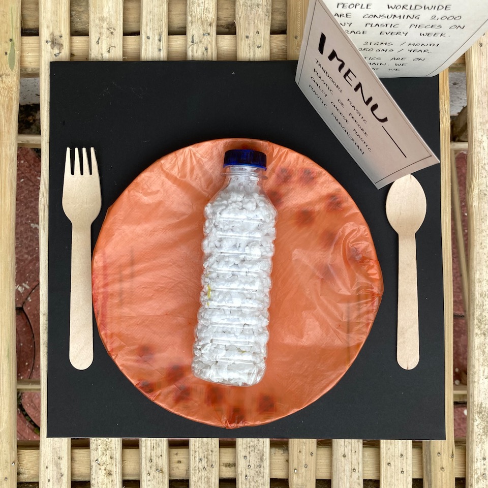
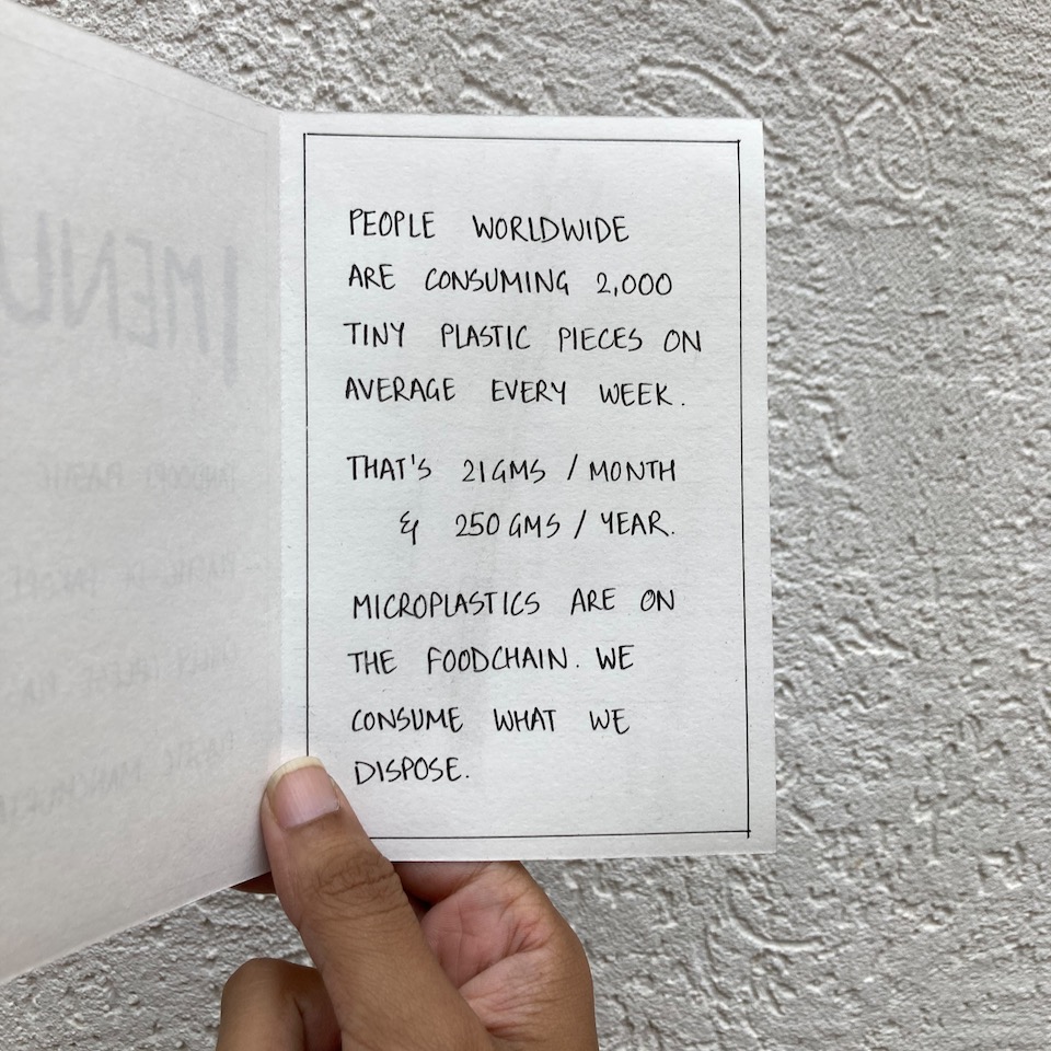
saoni ruikar: “plastics are in the foodchain, and people ingest ¼ kg plastic a year”.
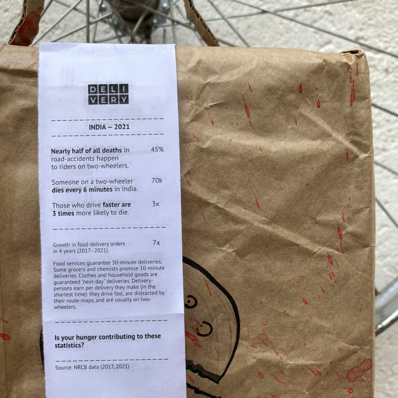
uddipta gogoi: 2-wheelers showed up in three statistics in india: 50% of all road deaths in india involved people on 2-wheelers ; a staggering rise in “quick” home-delivery services was being fulfilled by ‘gig’-workers riding 2-wheelers ; and, driving “quick” led to a three-fold increase in road-accident deaths. (note: i worked with uddipta on the text after the workshop.)

—
a designer’s allegience: data or affect?
human endeavour should evidence integrity, compassion, and morality; and be about using technology to improve the world (instead of misusing the world to improve technology). once you grow past the initial infatuation with your craft, i hope you realise that working with data is no different.
our work is free to be visual, sonic, tasty, written, miniscule, fleeting, grand, intricate, painful, or something else: as long as it is affective.
now, go!, make good art.
-
in 2014, the World Bank studied how most reports published by it are never downloaded. the Washington Post wrote about it, and questioned how the world-bank’s work may contribute to change if it is seldom read. ↩